Portfolio
historic Salisbury Foundation
- My ROLE -
Marketing & Graphic Design
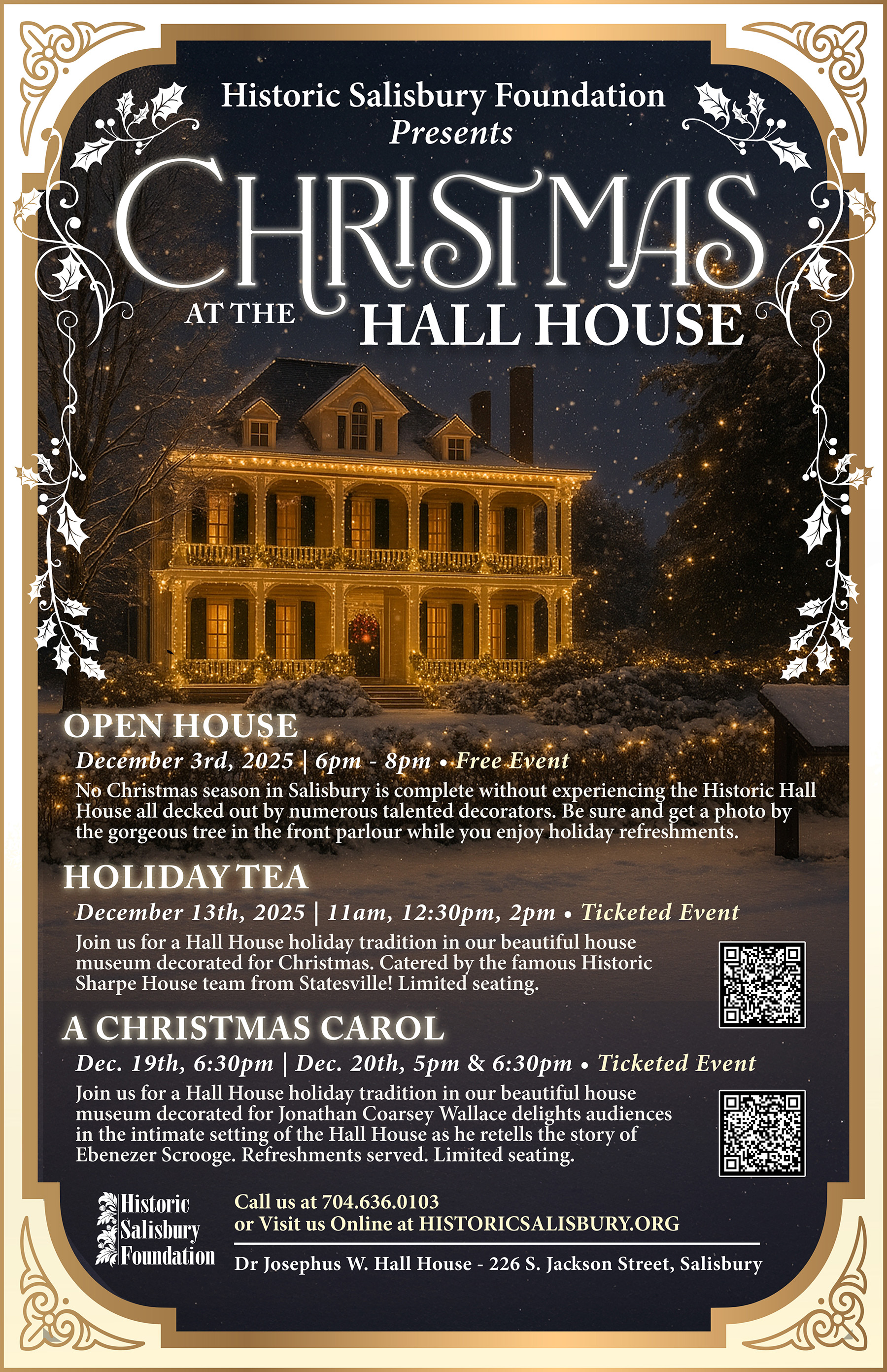
As the Marketing Coordinator & Graphic Designer for Historic Salisbury Foundation, I create marketing campaigns and visual designs that help promote historic preservation, community events, fundraisers, and historic preservation.
Over the past two years, I’ve designed everything from brand identities and publications to environmental graphics, social media, and print materials. Helping connect thousands of people with Rowan County’s history.
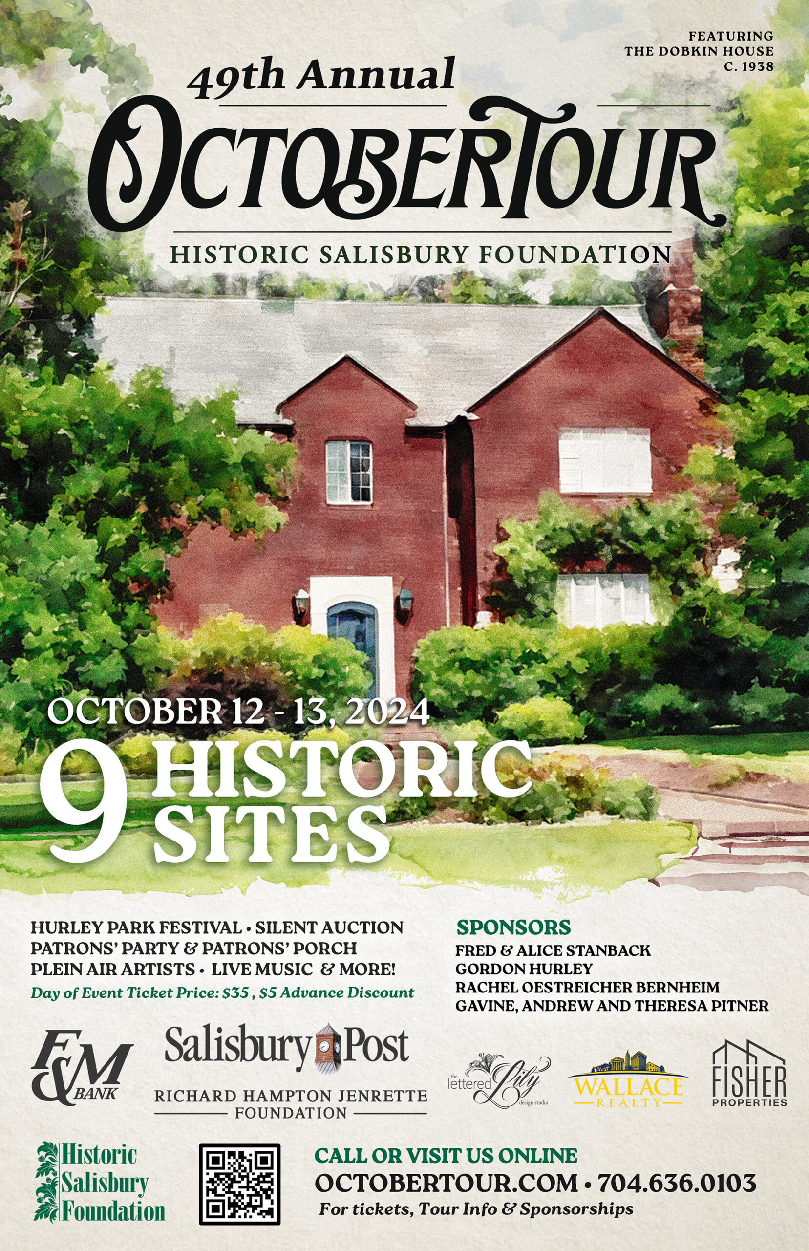
꩜ OCTOBERTOUR / HSF
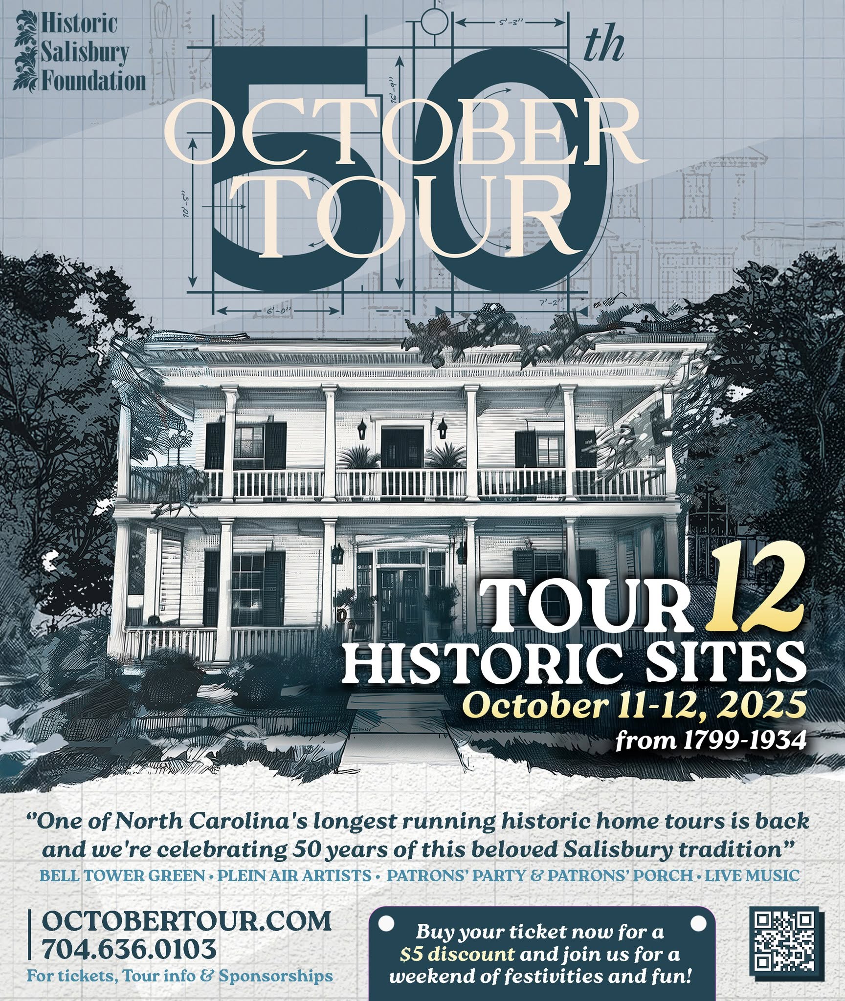
OctoberTour is Historic Salisbury Foundation’s signature annual fundraiser and one of the oldest historic home tours in the South. Each October, visitors explore some of Salisbury’s most significant historic homes and landmarks while enjoying guided tours, local vendors, live entertainment, and community events. Proceeds directly support HSF’s mission to preserve, protect, and revitalize the historic fabric of Salisbury and Rowan County.
The Challenge
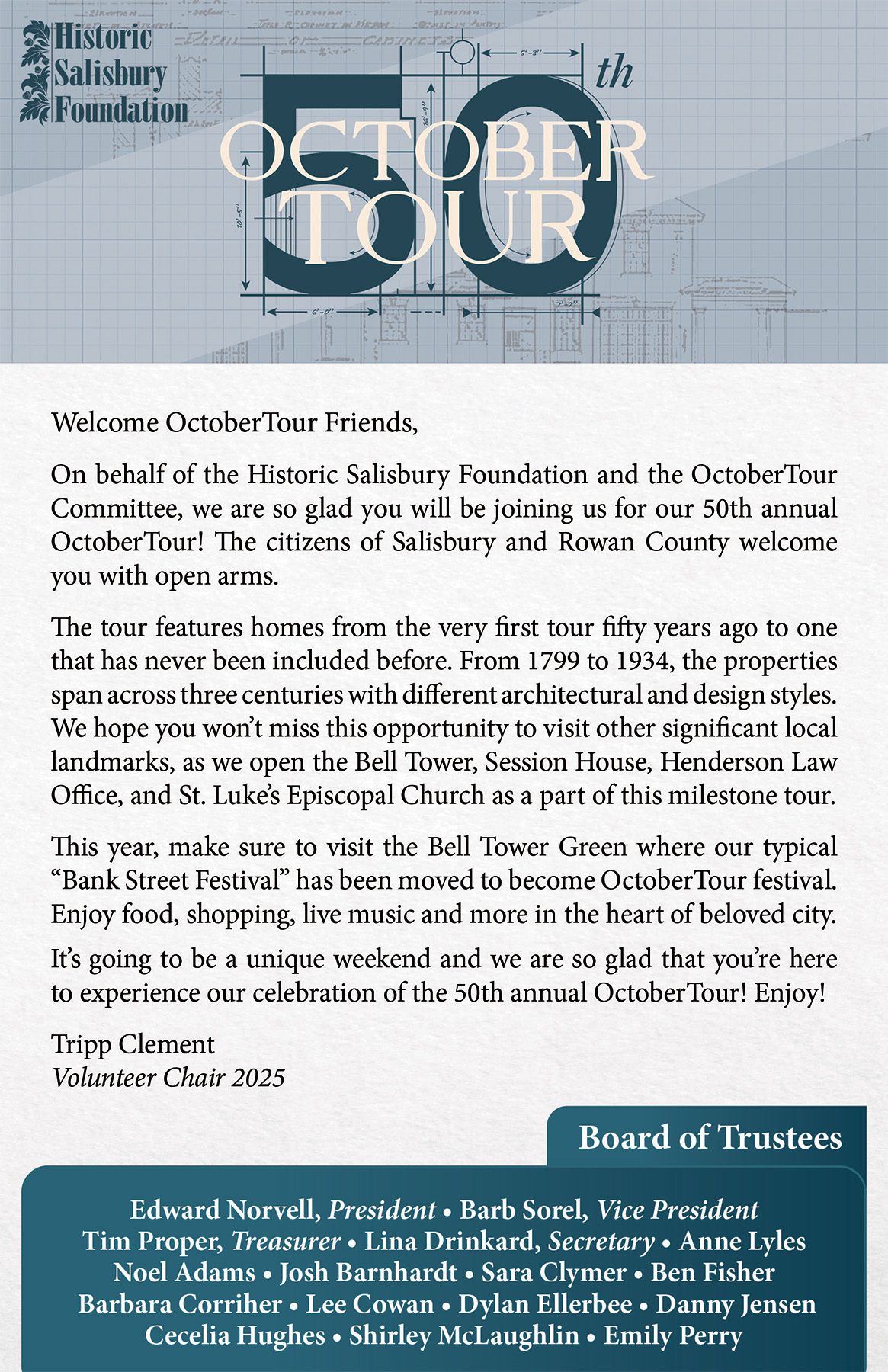
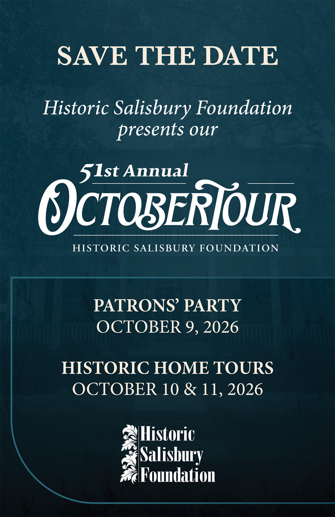
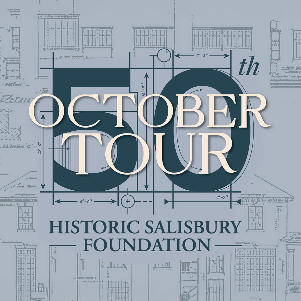
For the 50th Anniversary of OctoberTour, I structured a campaign that honored the events long history and the big milestone of 50 years of tours. The challenge was to design a visual identity that could live up to dozens of print and digital assets. from posters, tickets, brochures, and signage to social media, email marketing, and sponsorship materials. Everything while keeping everything consice and recognizable.
• • • Inside the Campaign • • •
Design approach
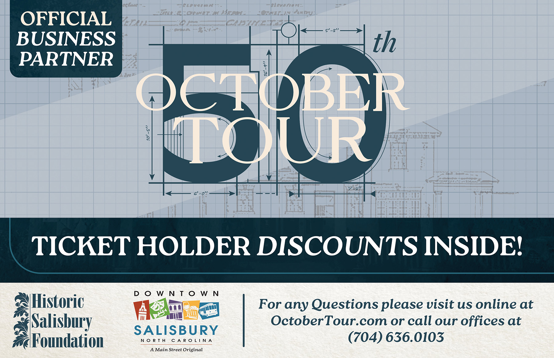
My approached to this design was straight forward, a combination of old and modern; combining modern minimalist graphics with vintage drawings or blueprints. I used a bold color palette, strong typography, and a clear visual hierarchy helped me organize the content while maintaining a consistent look across brochures, tickets, social media, newsletters, email marketing, and print materials.
Campaign assets
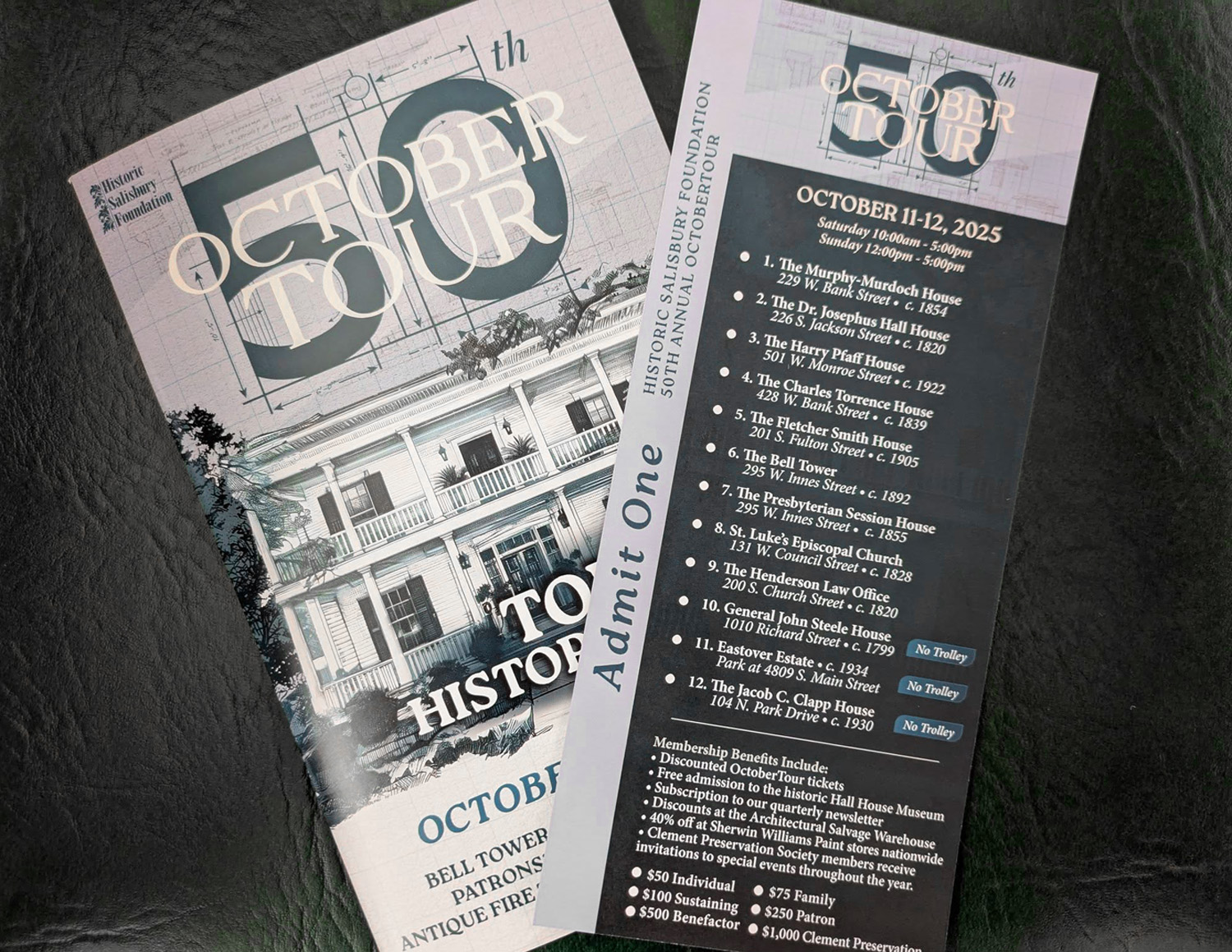
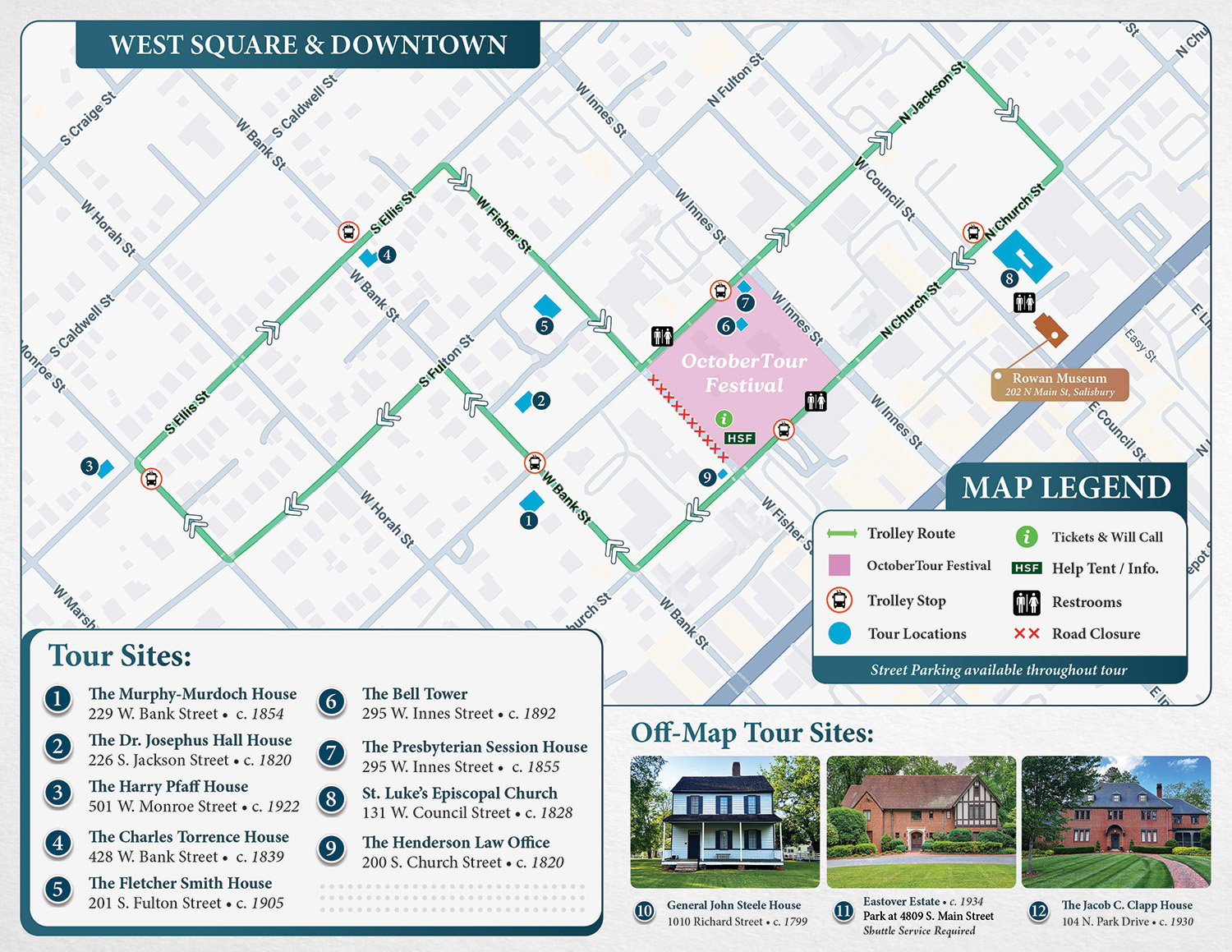
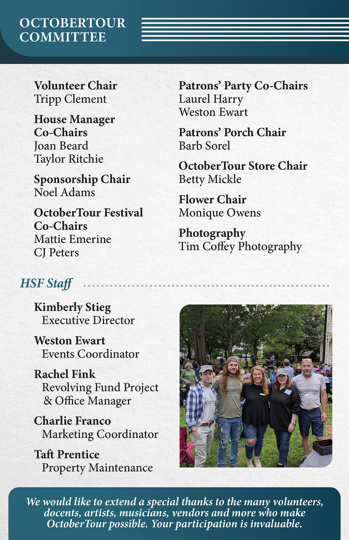
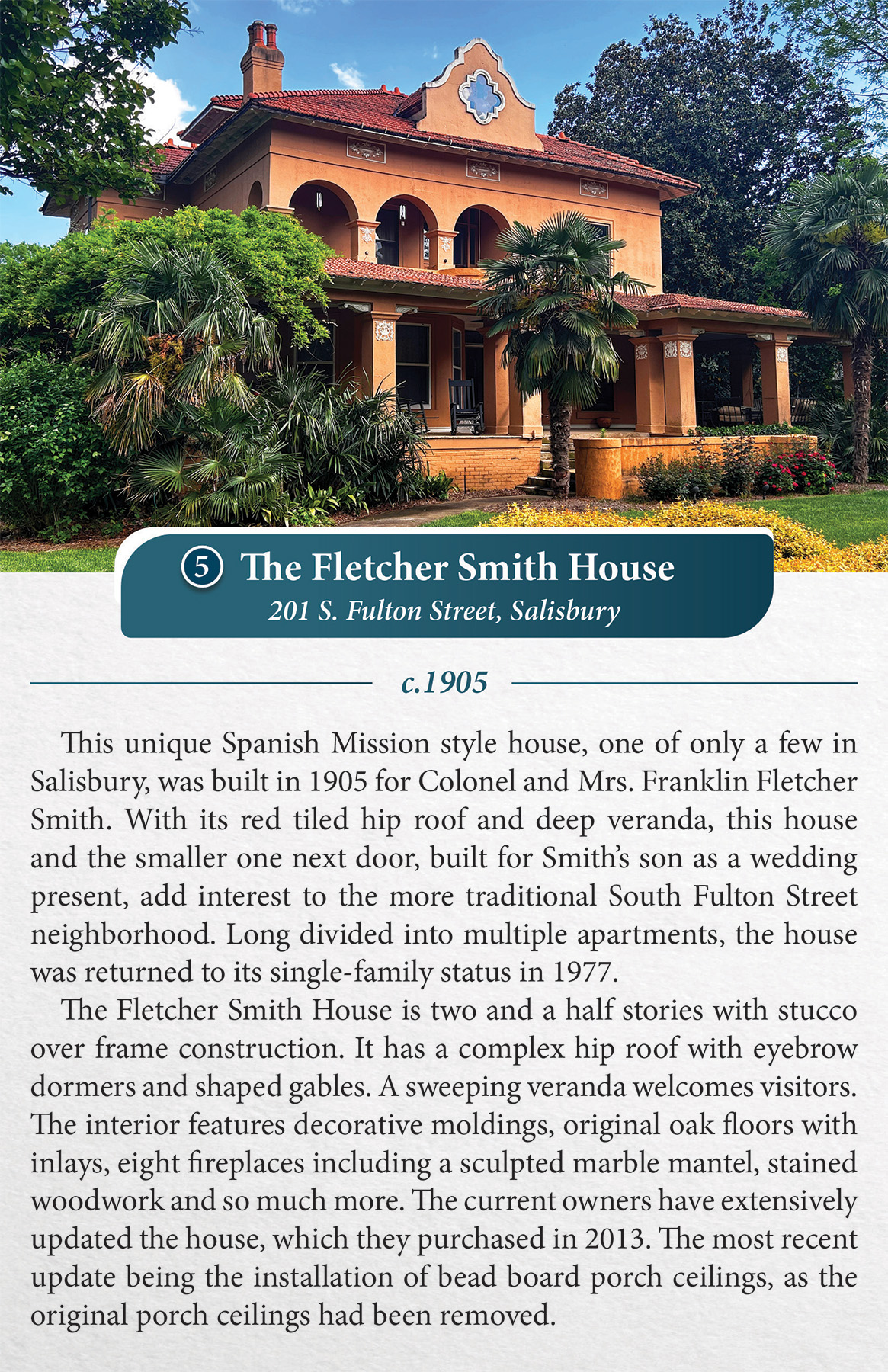
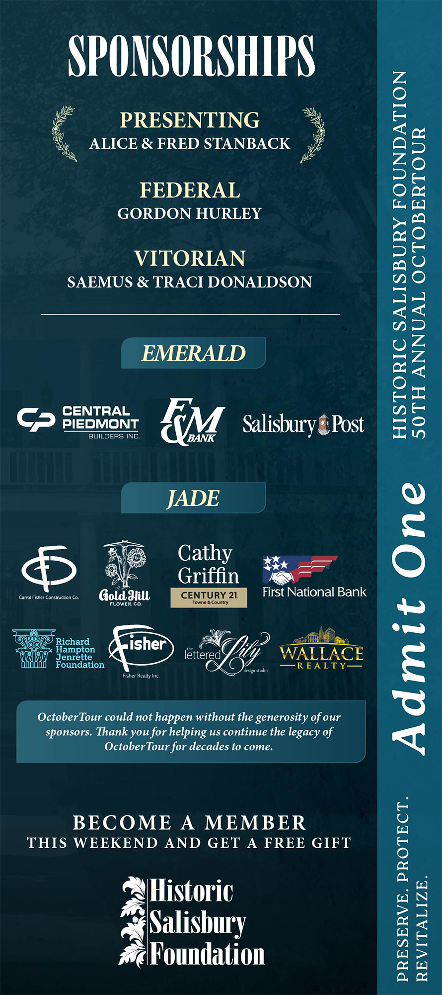
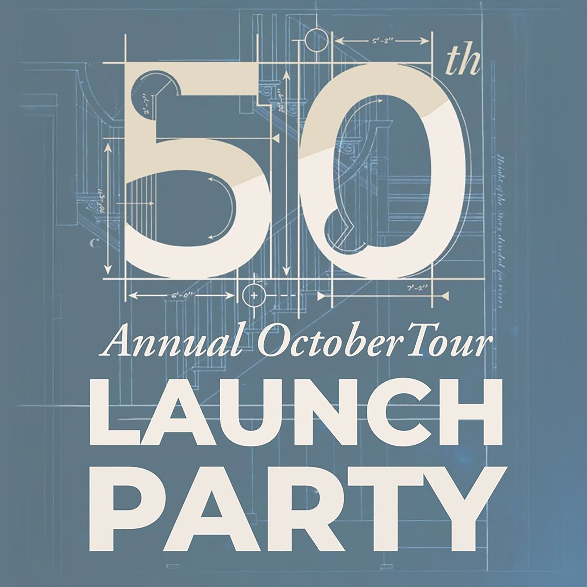
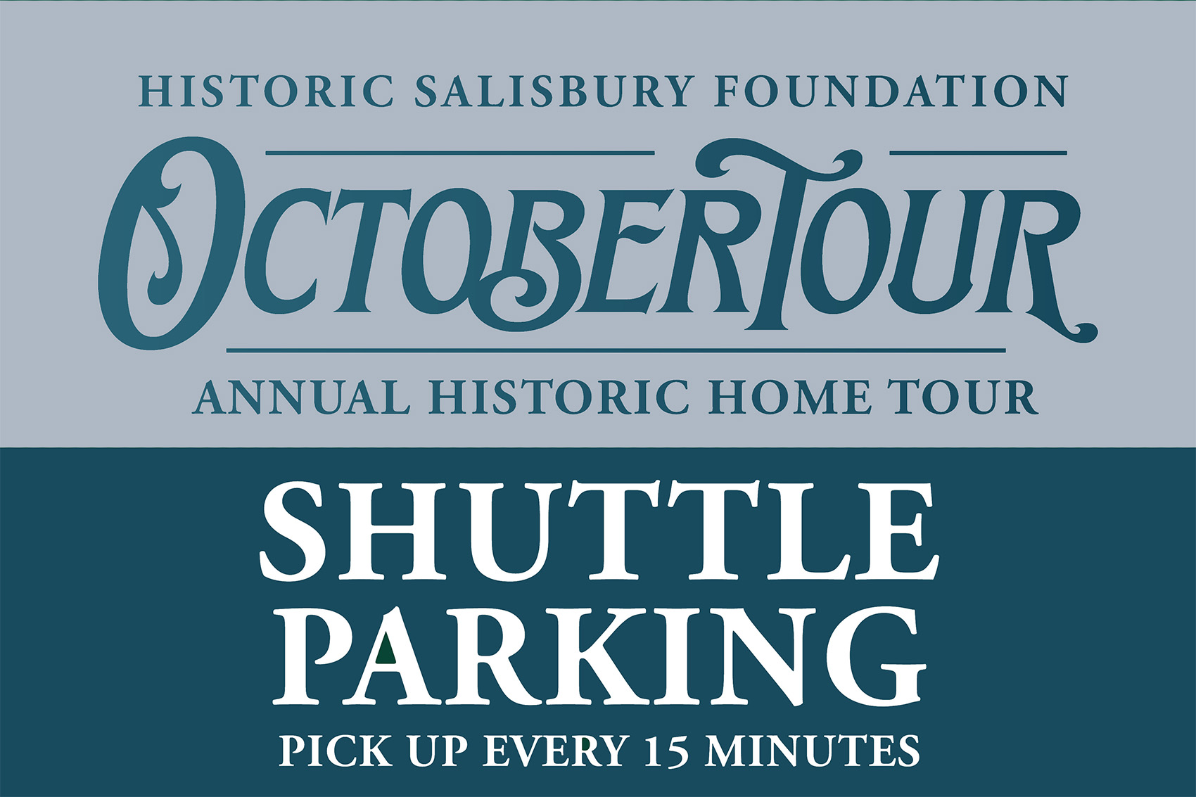
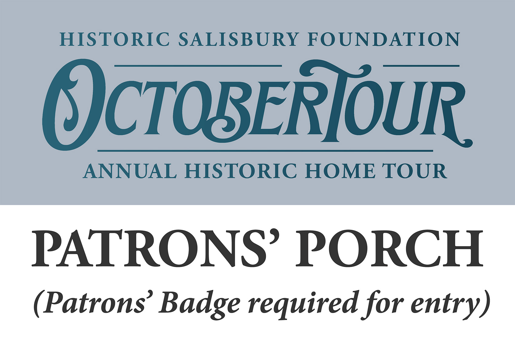
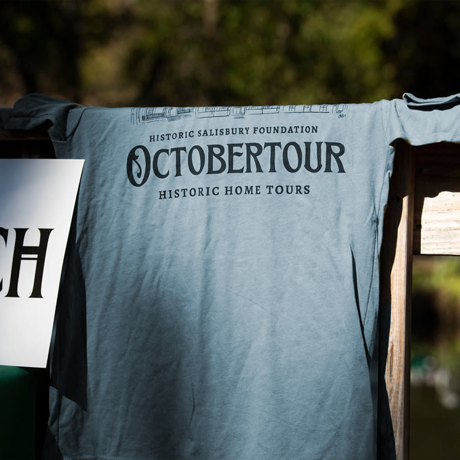
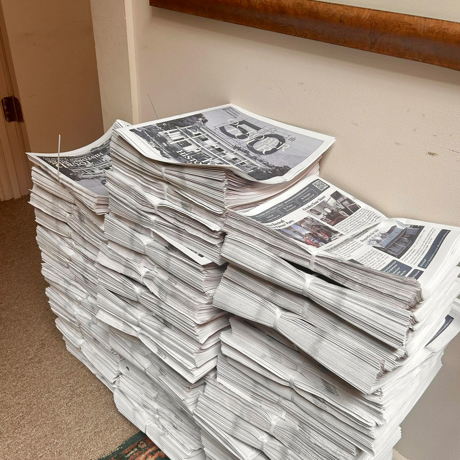
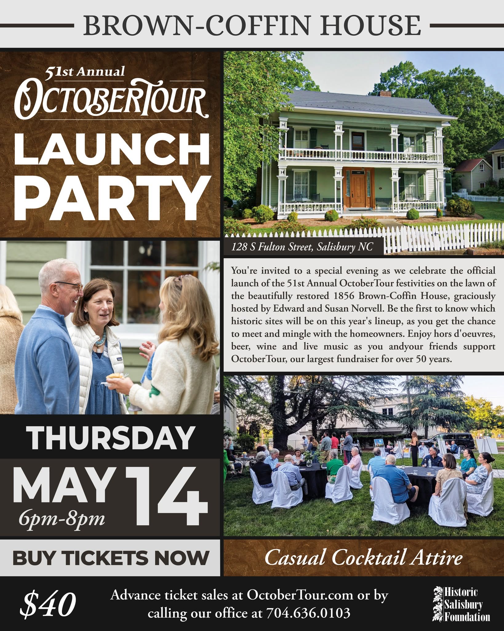
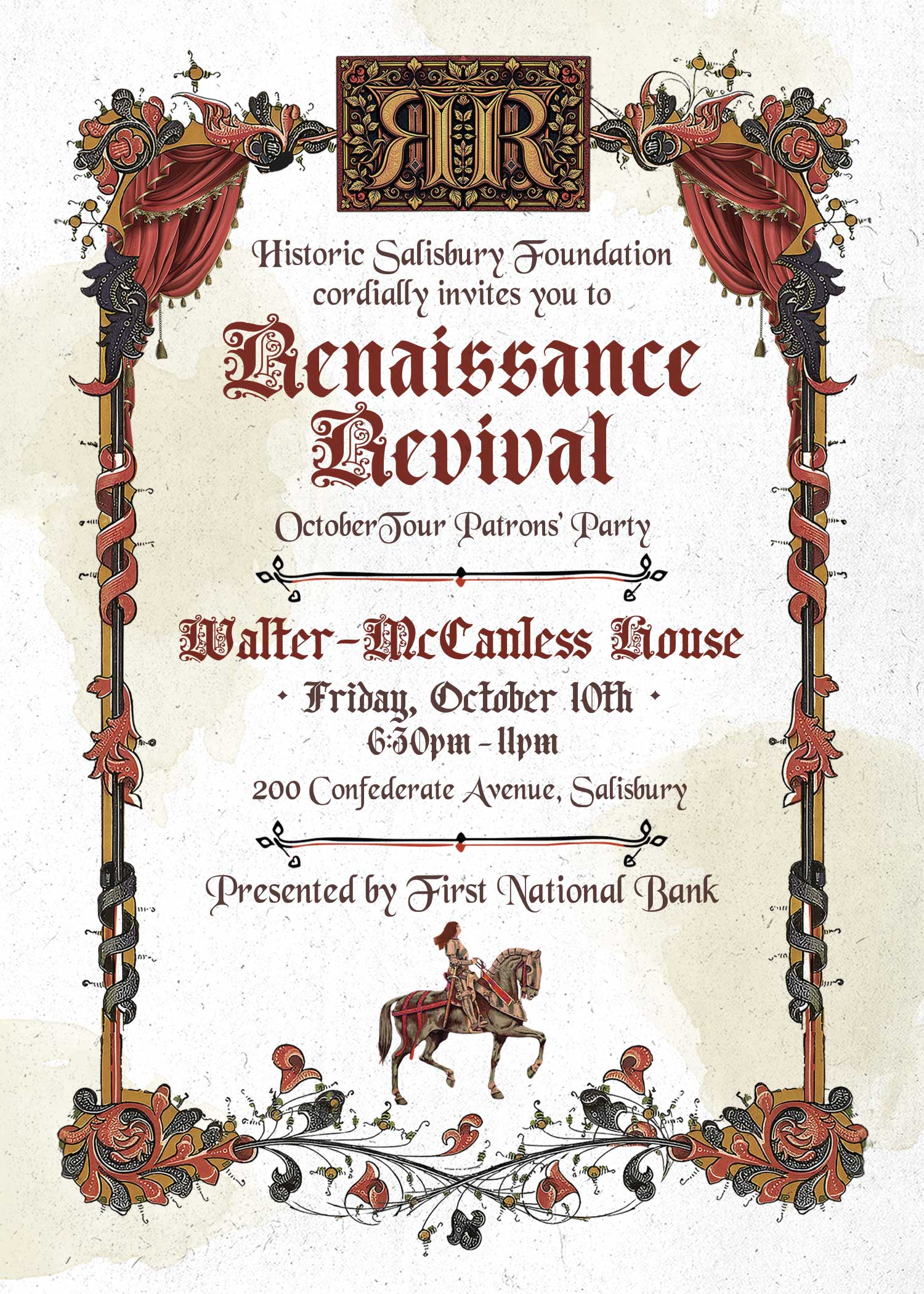
Throughout the campaign, I designed a variety of materials including posters, brochures, tickets, social media graphics, email marketing, newspaper inserts, sponsorship graphics, and the official event booklet. Every piece was designed to support the event while maintaining a consistent visual identity.
• • • Tickets & Business partners • • •
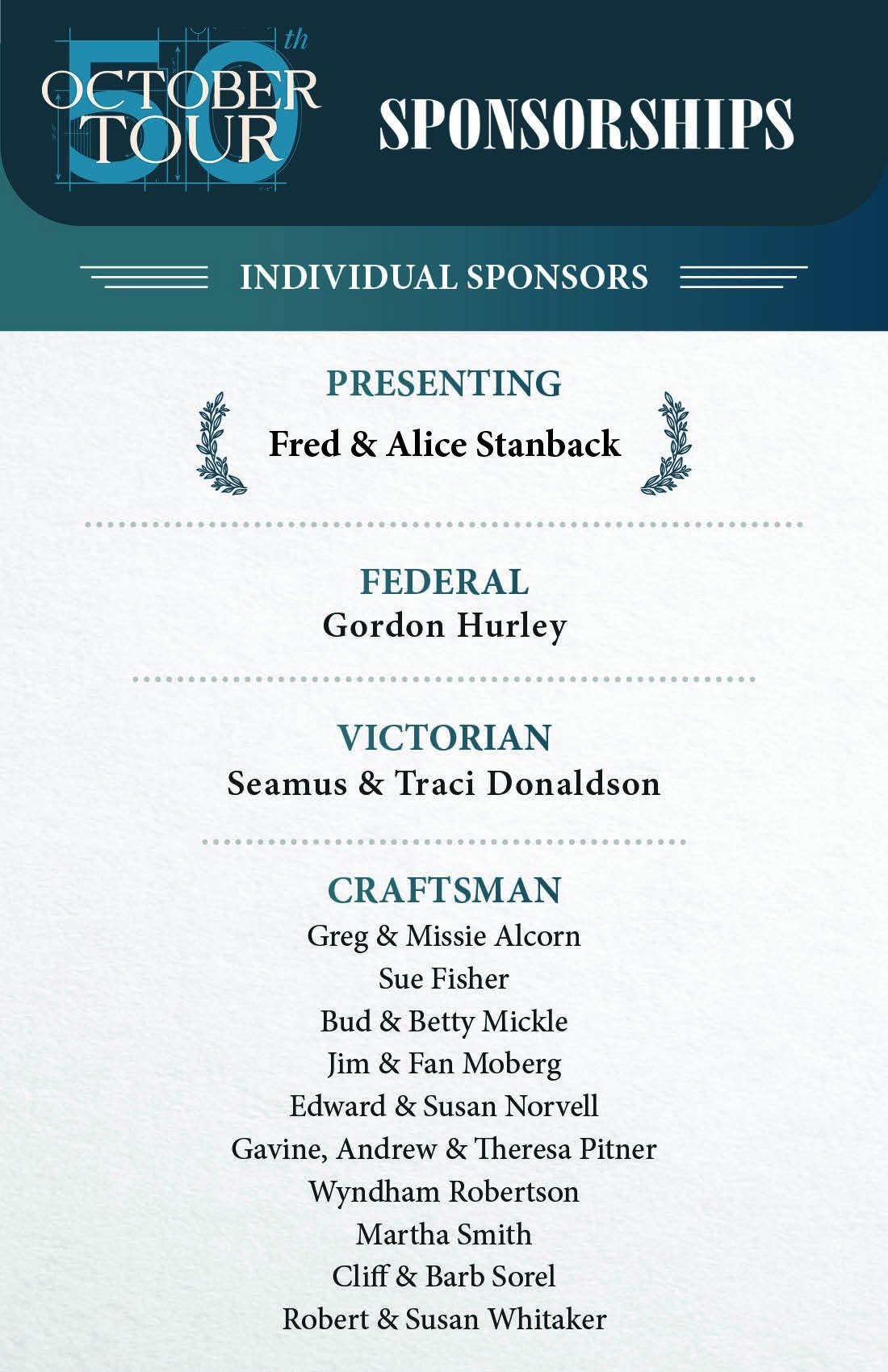
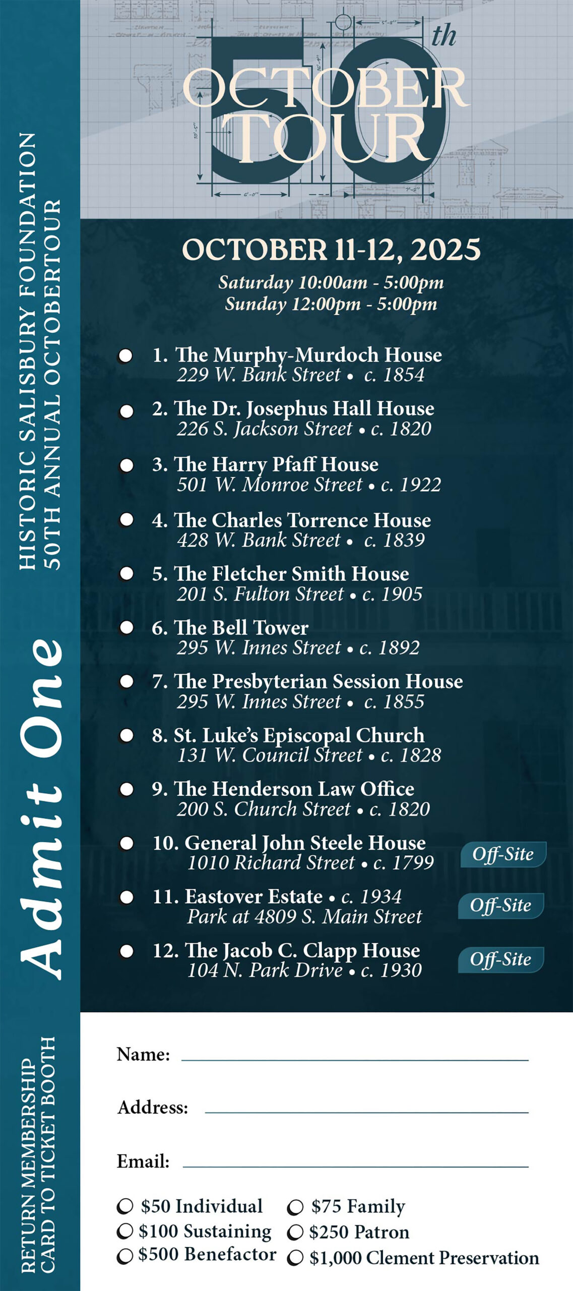
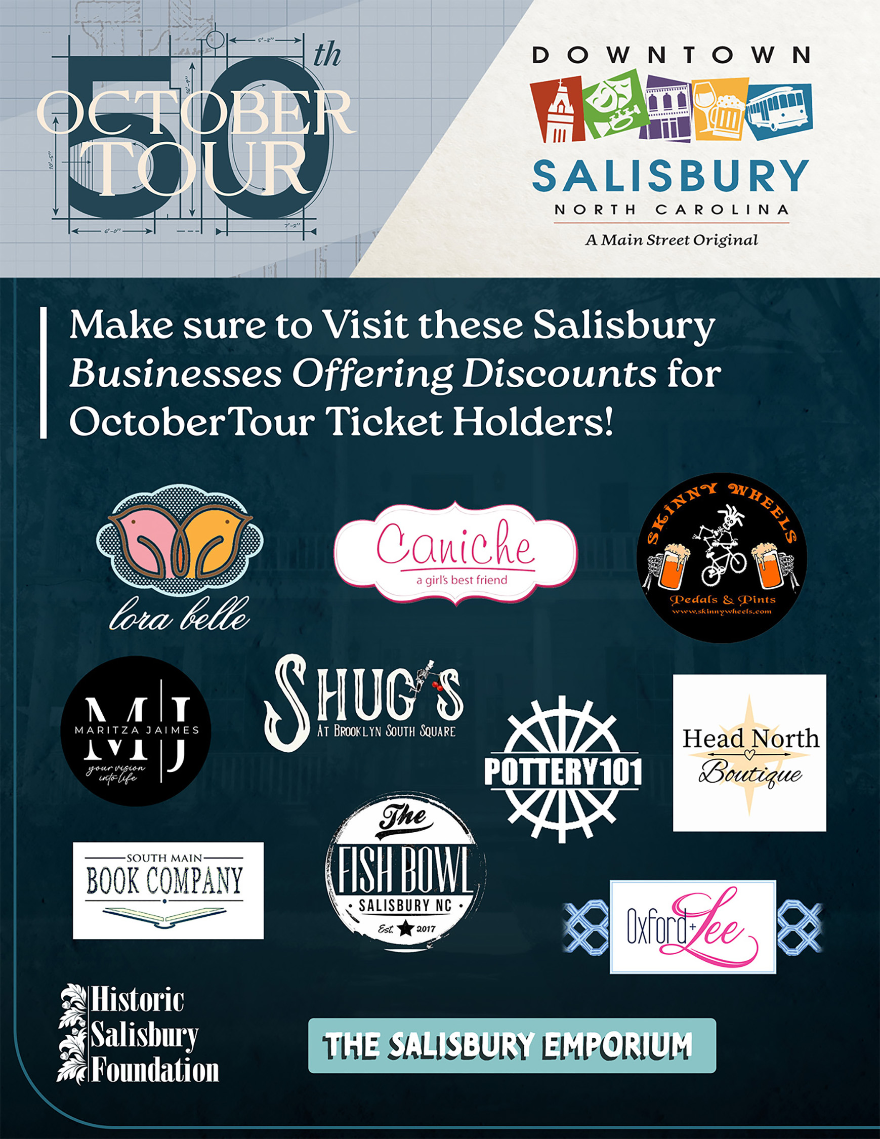
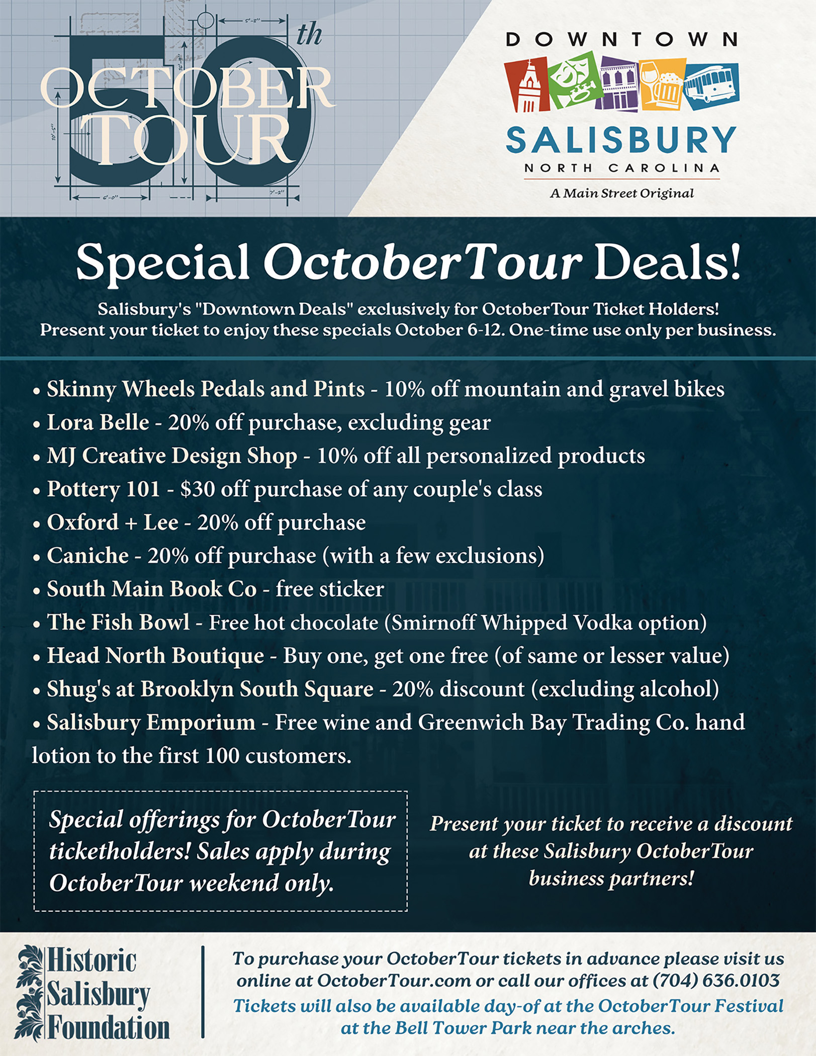
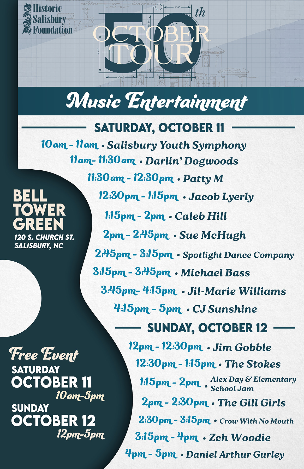
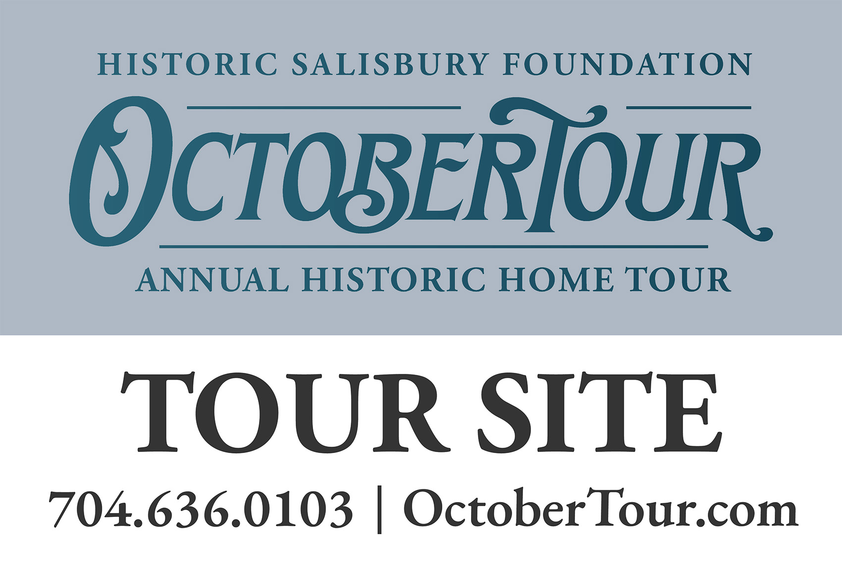
The event tickets were designed to complement the OctoberTour brand while providing attendees with clear, functional information in a clean and cohesive format. Also created graphics for business partners and musicians.
• • • Octobertour logo • • •
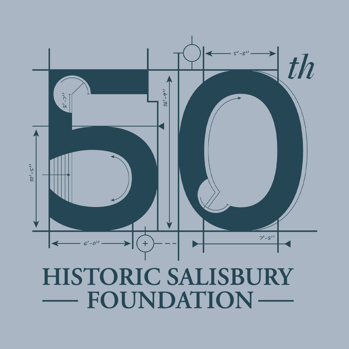
Designed as the centerpiece of the 50th anniversary campaign, the logo incorporates architectural drafting lines, historic imagery, and refined typography to create a visual identity that reflects both craftsmanship and preservation.
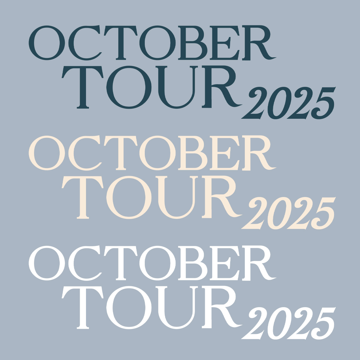
Fonts
Octobertour Color palette
4. results
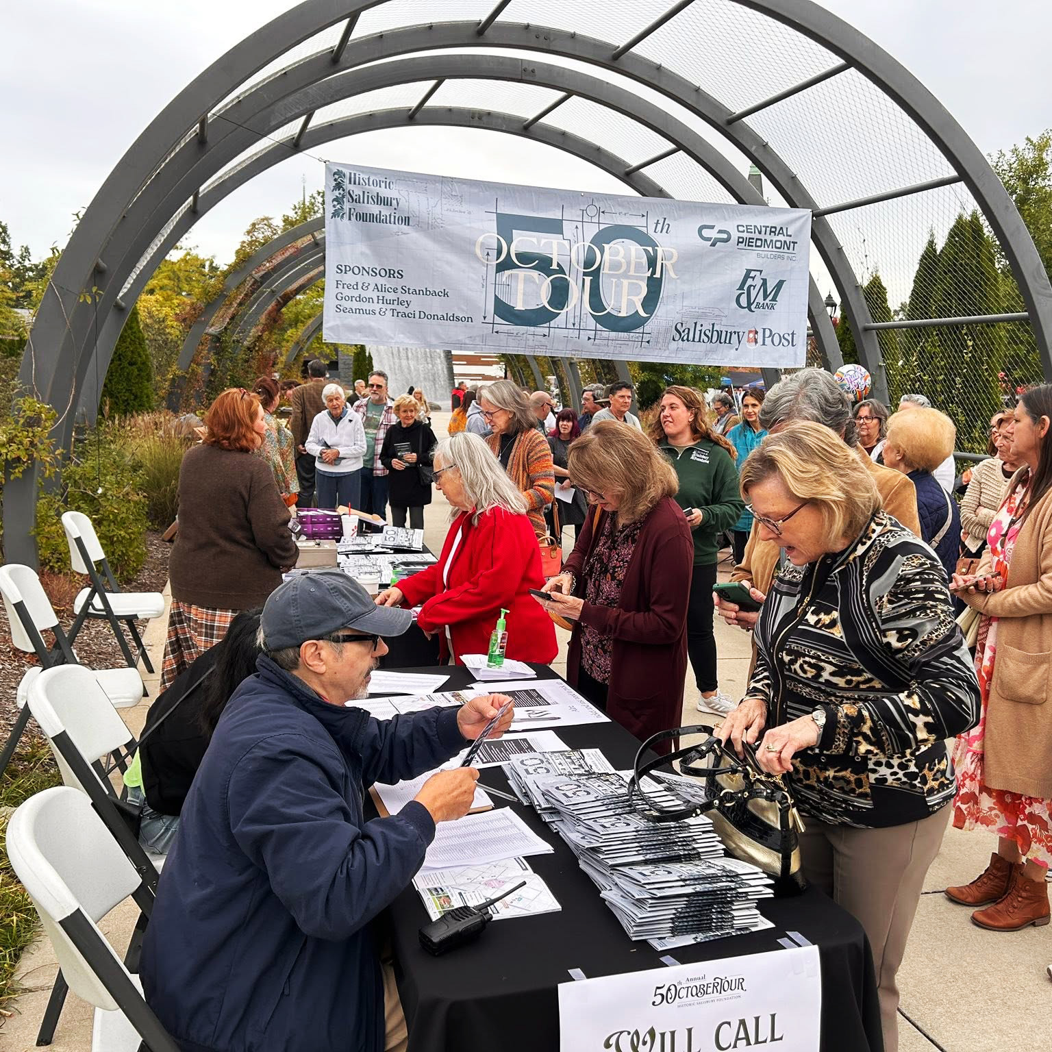
OctoberTour welcomed over 1,200 attendees and remains one of Historic Salisbury Foundation’s largest annual events. Working on the campaign, it gave me the opportunity to create a complete marketing system that reached audiences across multiple platforms while supporting sponsors and encouraging community participation.
• • • Final Thoughts • • •
OctoberTour has been my biggest accomplishment so far because it challenged my abilities and also gave me the opportunity to create and juggle a complete visual campaign, balancing editorial design, print production, and digital marketing while maintaining a cohesive identity across every deliverable.
꩜ History on Tap / HSF
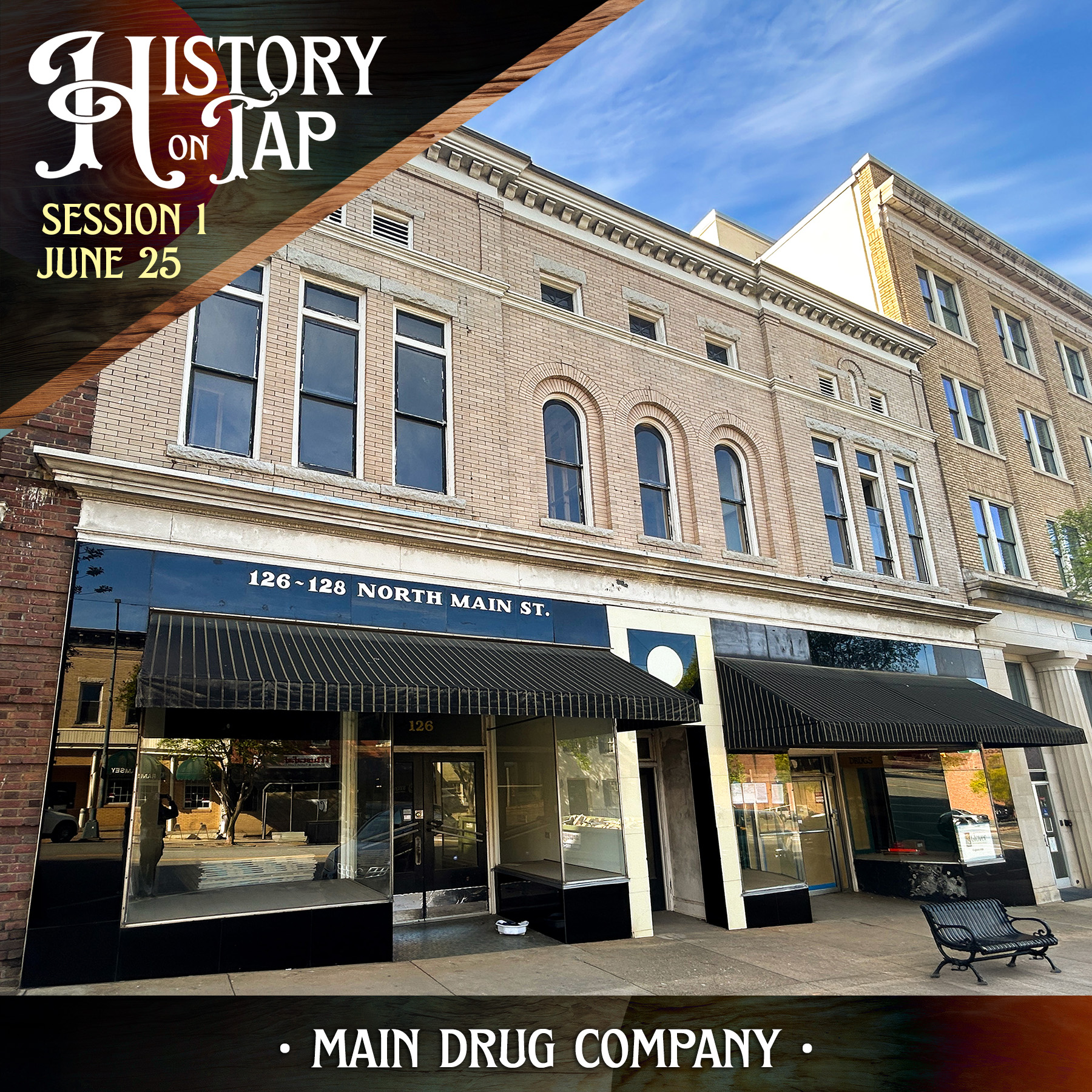
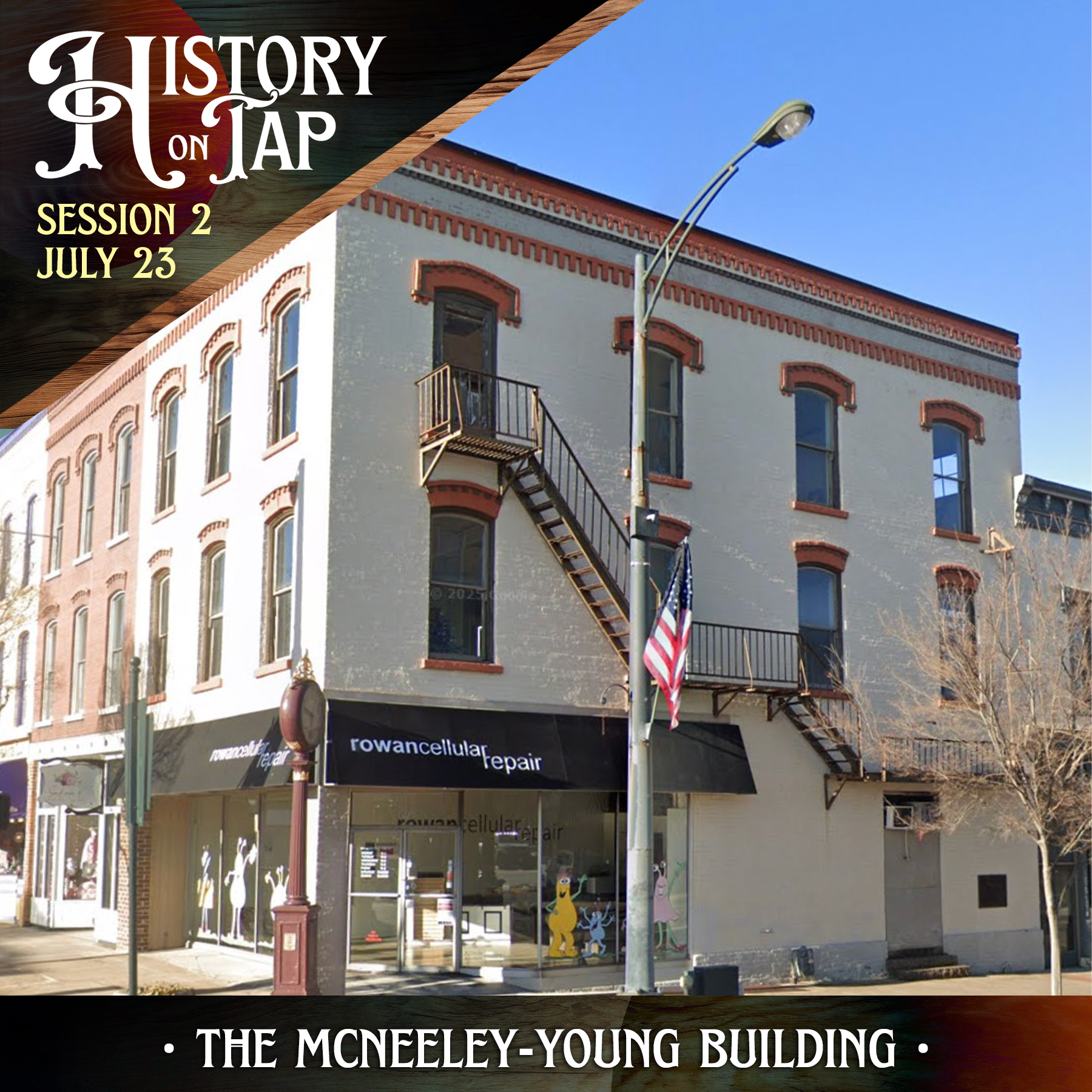
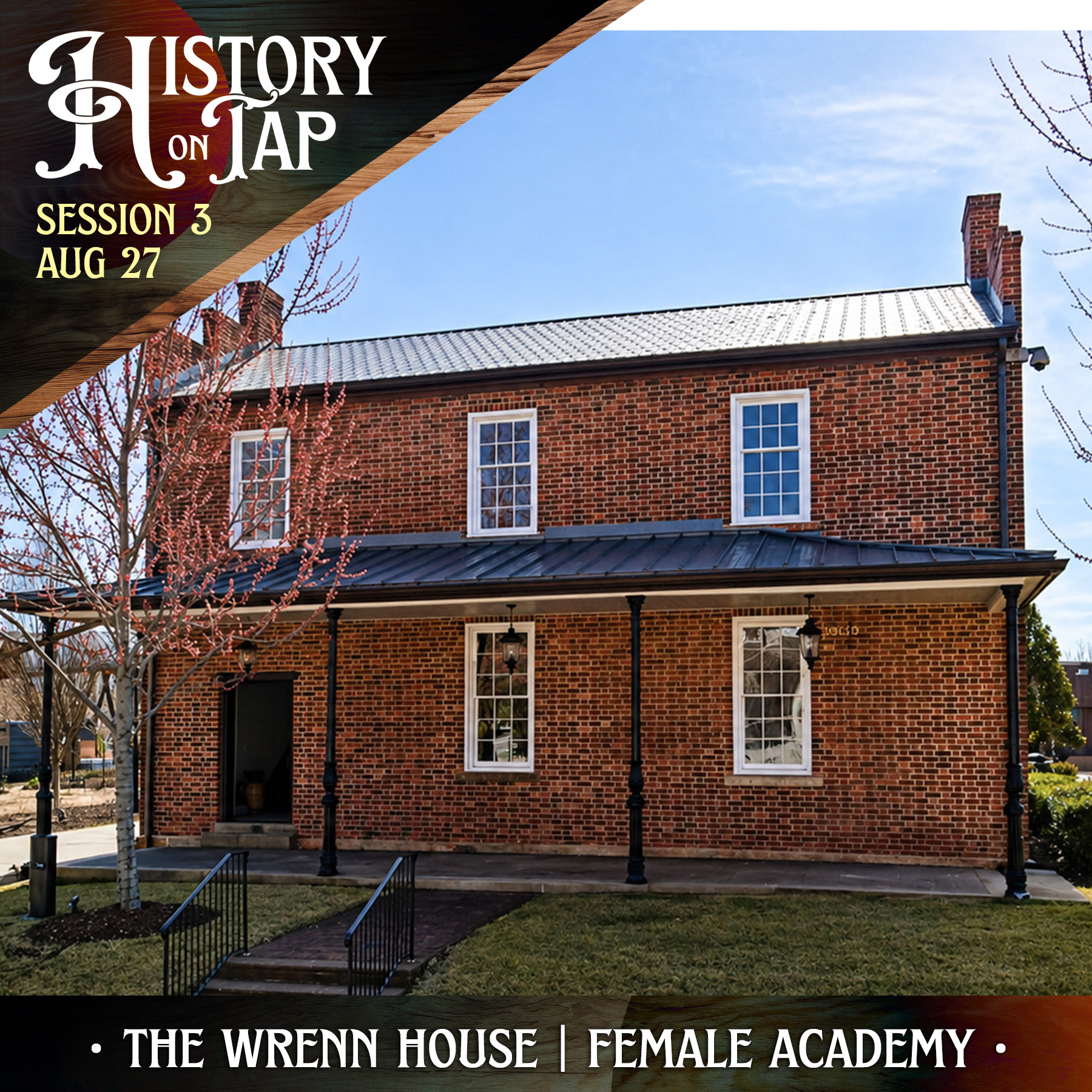
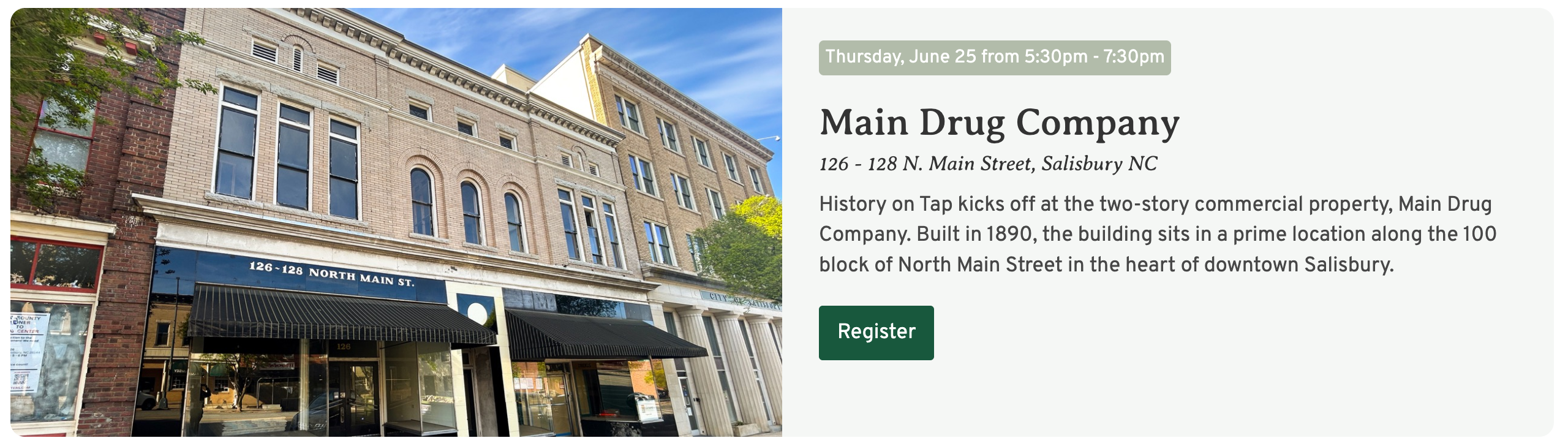
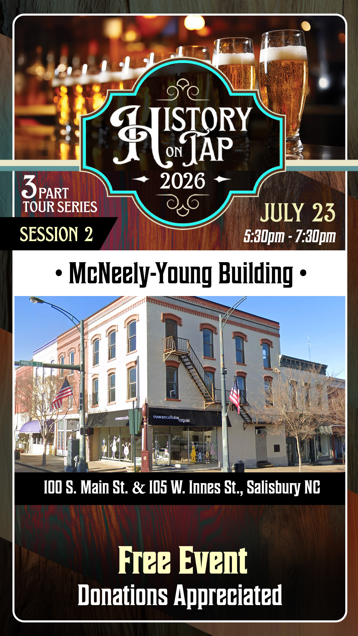
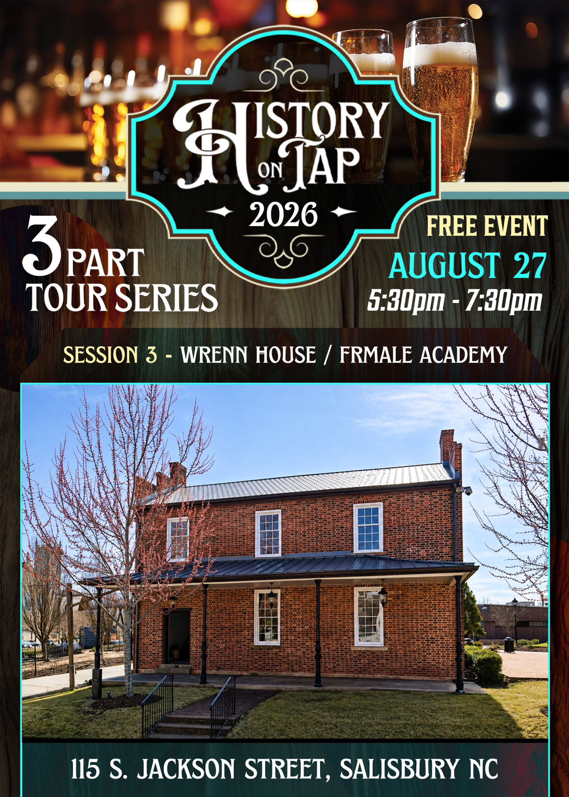
History on Tap is a seasonal event series designed to connect the community with Rowan County’s historic landmarks through guided tours, local craft beer, and live music. My role was to develop a consistent marketing campaign that promoted each event while adapting the design to showcase each featured location.
The Challenge
History on Tap needed a recognizable visual identity that could adapt across multiple venues and historic sites while remaining consistent from one session to the next.
• • • Inside the Campaign • • •
design Approach
The goal was to create a unique identity that felt inviting, approachable, and focused on the community while it reflects the history of each location. I combined bold typography, bright colors, and a consistent visual system, the campaign remained recognizable across posters, social media, email marketing, and event materials while keeping the community engaged.
Campaign Assets
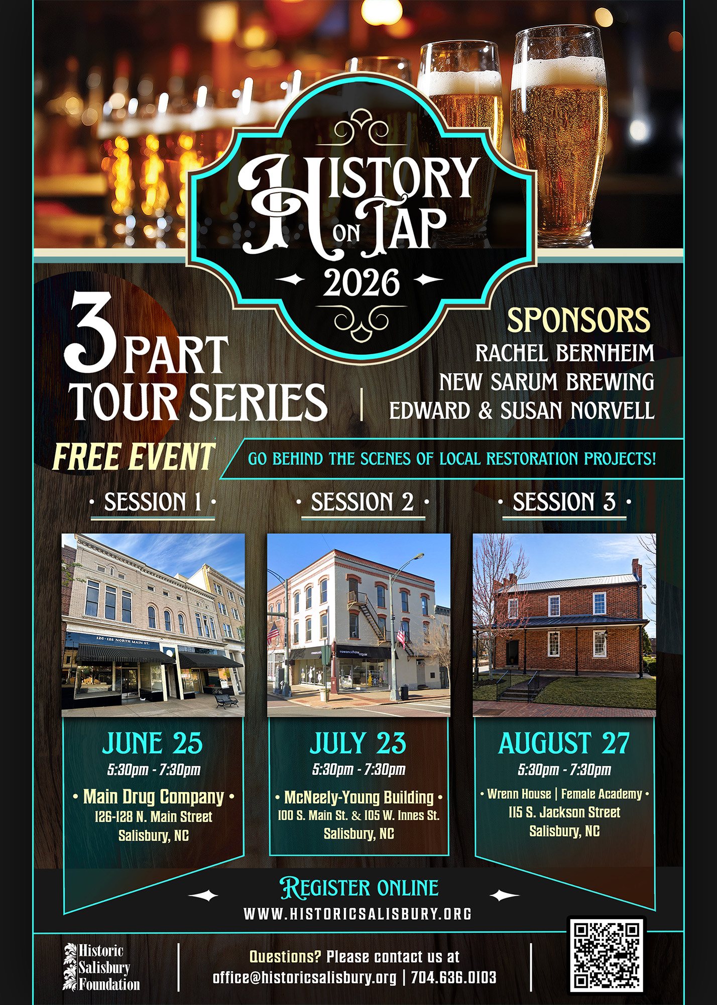
Each graphic was designed to maintain a consistent visual identity while effectively communicating event details.
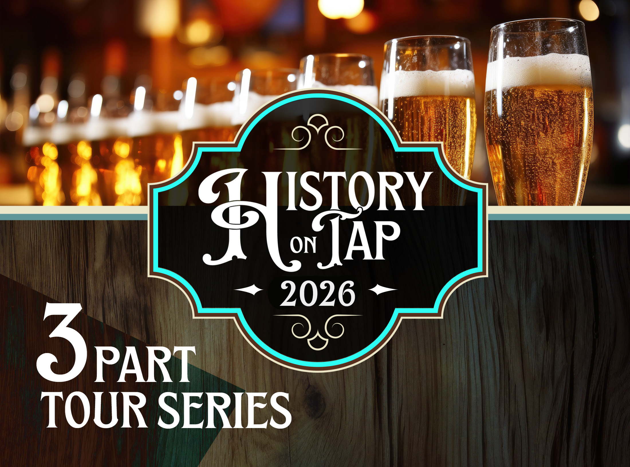
Three part Summer Series
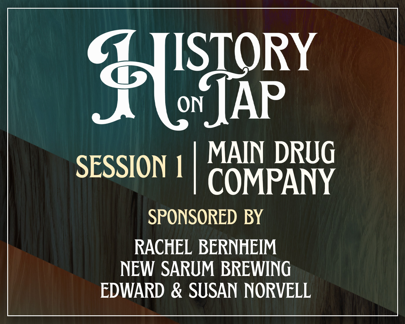
I also created a cohesive suite of marketing materials to communicate event details and highlight sponsors across social media, email campaigns, newsletters, and print, ensuring a consistent visual identity throughout the series.
• • • HISTORY ON TAP logo • • •
The History on Tap logo was designed to establish a recognizable identity for the event series while remaining flexible across digital platforms. Its clean, and easy to recognize.
History on tap Color palette
results
Seeing more than 300 people attend each event made this project special. It was rewarding to watch a campaign I designed connect with the community and support an event series that celebrated Salisbury’s history.
• • • final thoughts • • •
History on Tap was a great opportunity to create more than individual promotional pieces. It was about building a recognizable campaign across three events. From branding and event graphics to digital marketing materials.
꩜ rECLAIMED RELICS / Architectural salvage warehouse
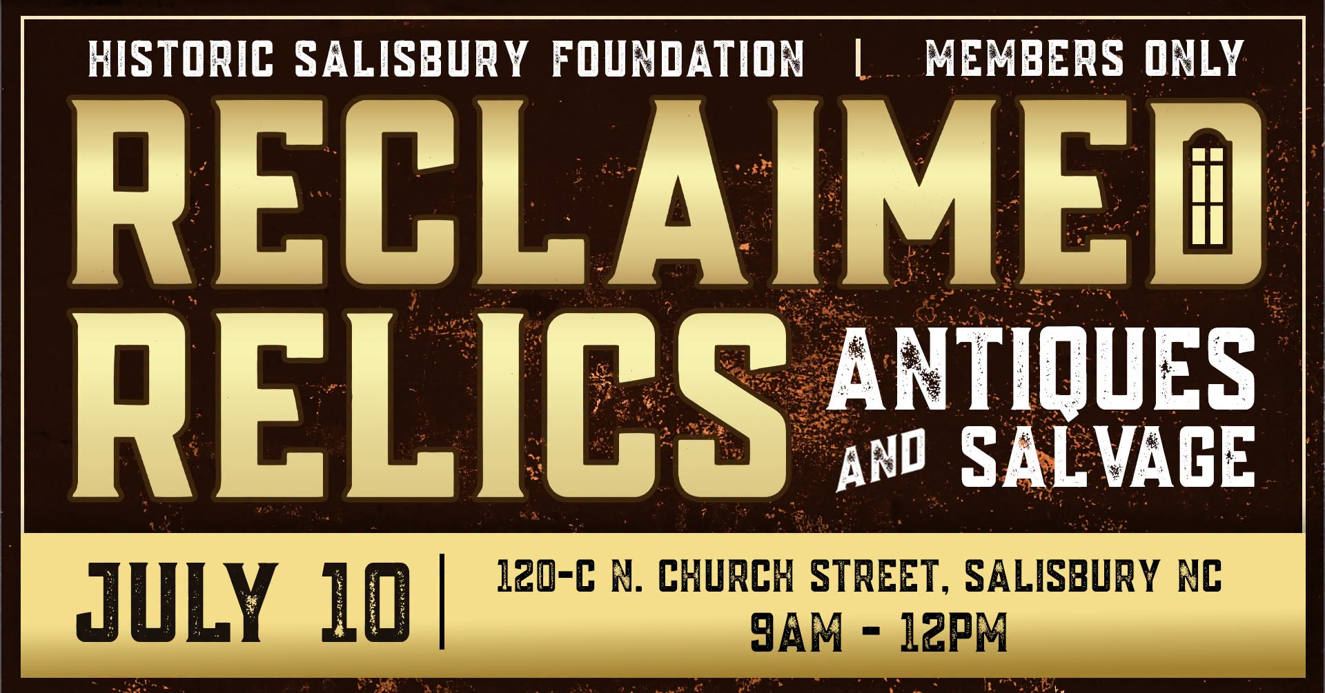
Reclaimed Relics is an architectural salvage warehouse operated by Historic Salisbury Foundation in downtown Salisbury. Its mission is to preserve local history by salvaging architectural materials and giving them a second life through reuse. As part of the warehouse’s relocation, I created a refreshed visual identity and marketing materials that celebrated its purpose while strengthening its presence within the community.
The Challenge
As the old architectural salvage warehouse prepared to relocate to its new downtown Salisbury location, it needed a visual identity that reflected its mission of preservation. The challenge was to create a brand that felt authentic, vintage, and inviting, capturing the character of reclaimed architectural materials without feeling outdated.
• • • Inside the Design • • •
Design Goals
The goal was to create a bold and recognizable identity that honored the character of reclaimed architectural items while increasing visibility for Historic Salisbury Foundation’s new warehouse. The design balances vintage style signs with modern readability to create a logo that is easily identifiable.
Concept Exploration and early designs:
Color exploration:
• • • The Final Design • • •
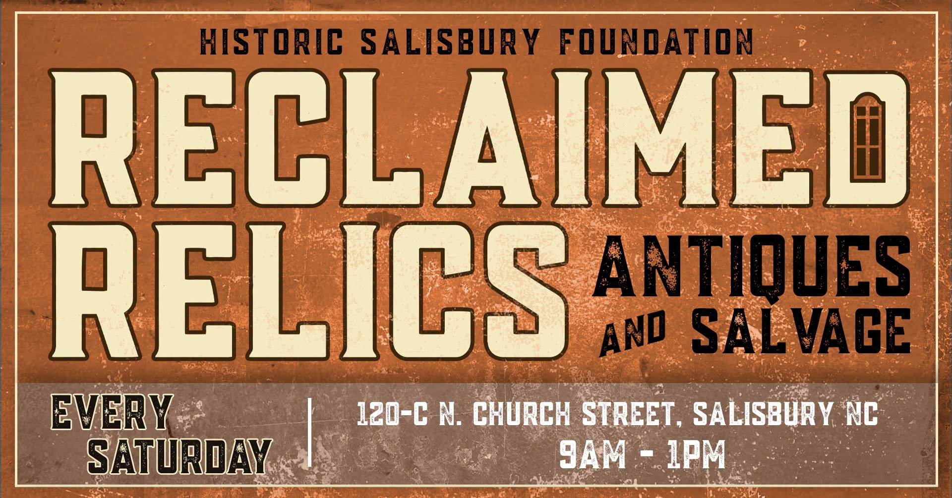
After exploring several creative directions, I realized the identity didn’t need to be flashy. Instead, I focused on creating something that felt familiar, authentic, and rooted in history. I used vintage style typography and textures that gave the brand a timeless character. Reclaimed Relics: Antiques and Salvage
Reclaimed relics Color palette
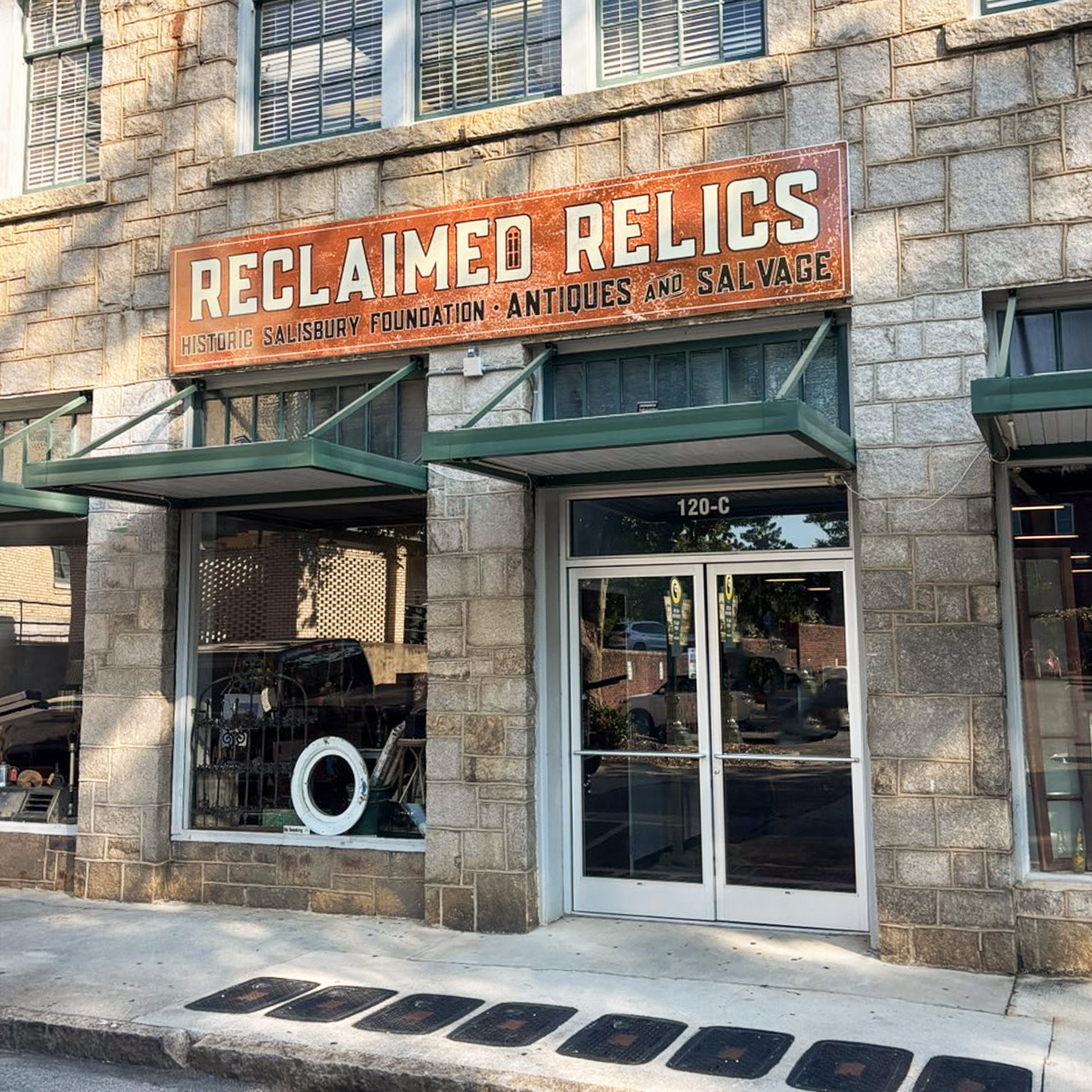
Brand in the Real world
120-c N. Church street, salisbury nc
The sign will stand tall for the next 10 years!
results
Seeing the Reclaimed Relics identity come to life was one of the most rewarding parts of the project. From the storefront sign to social media and promotional materials, the brand reflects the history behind the architectural salvage warehouse. It was exciting to see the concept evolve from early sketches into a real space the community could enjoy.
• • • final thoughts • • •
Reclaimed Relics reminded me that great branding is about more than creating a sign or a logo. It’s about capturing the personality of a place. I was able to create a logo that feels unique to Historic Salisbury Foundation’s mission.
꩜ featured projects
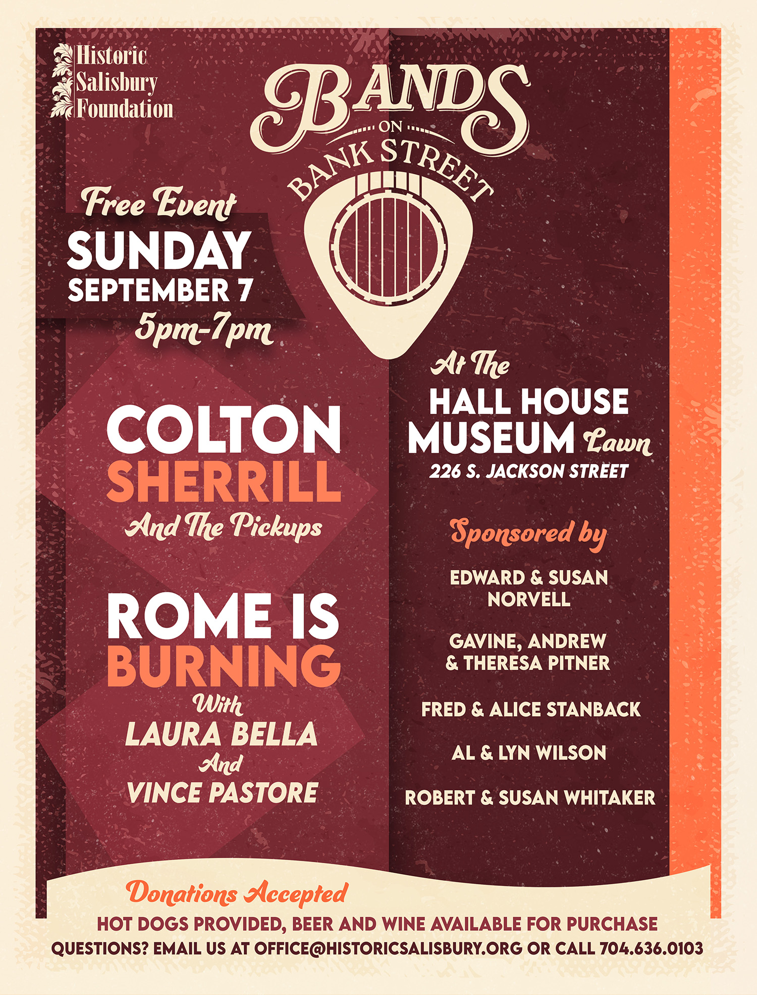
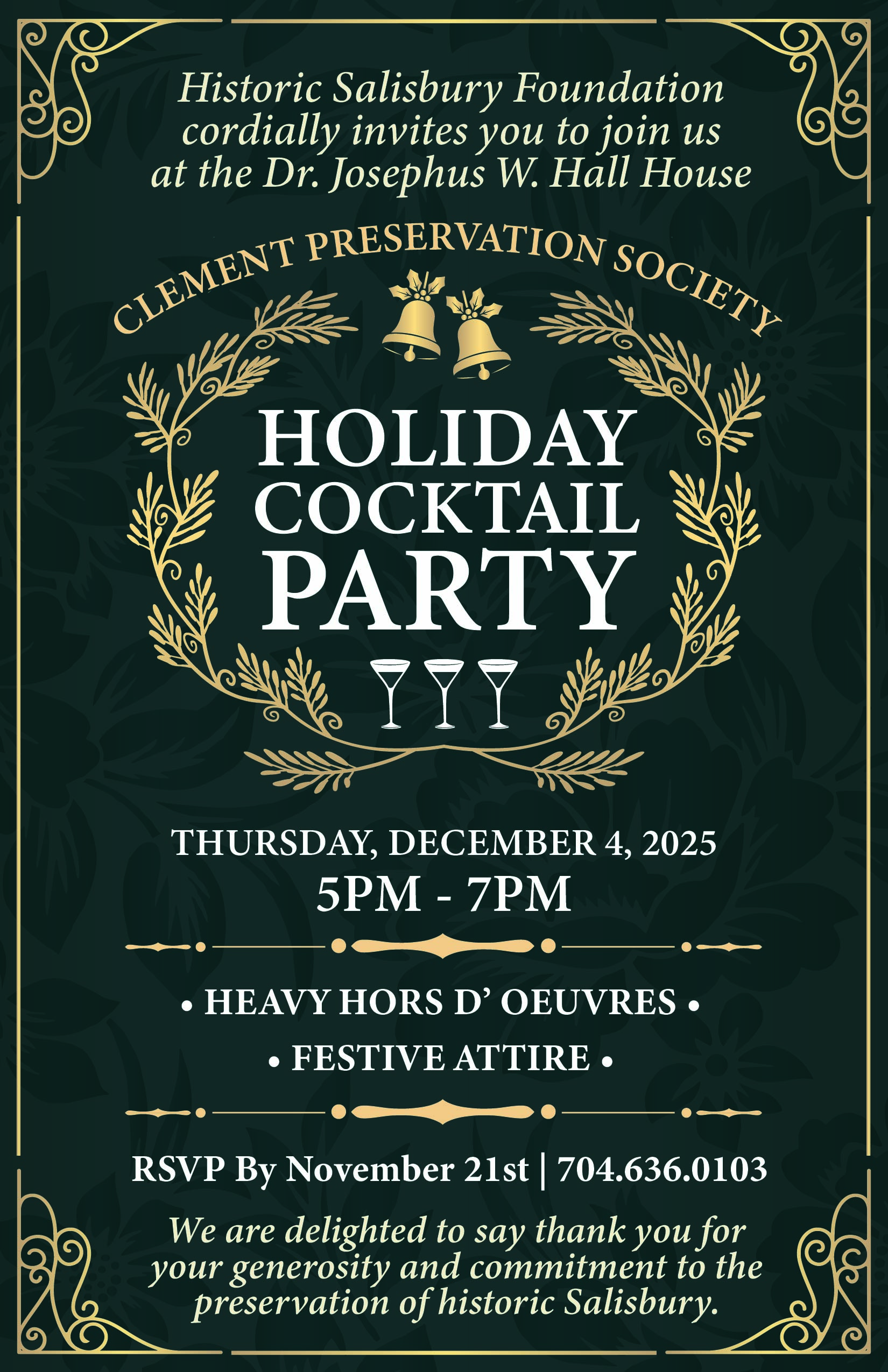
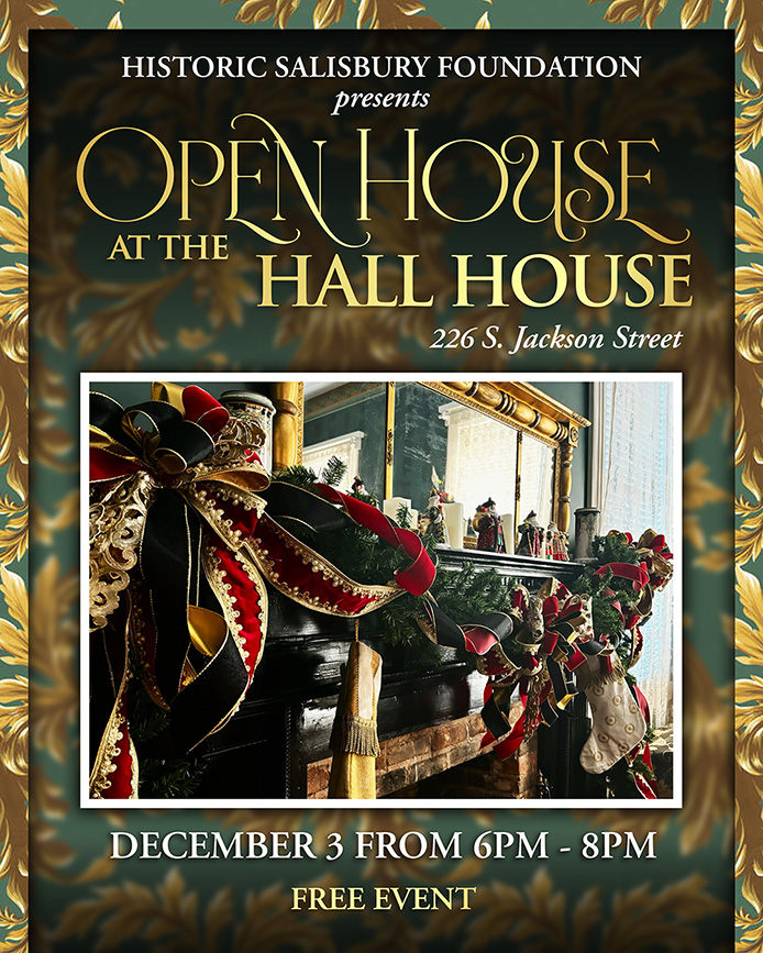
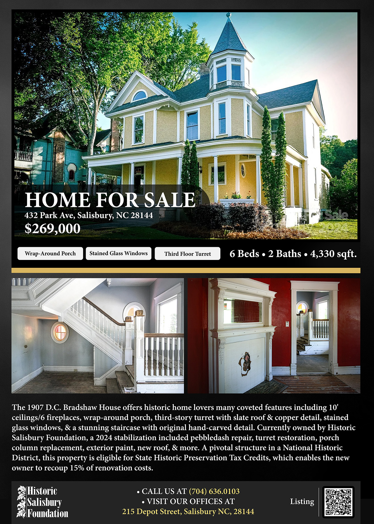
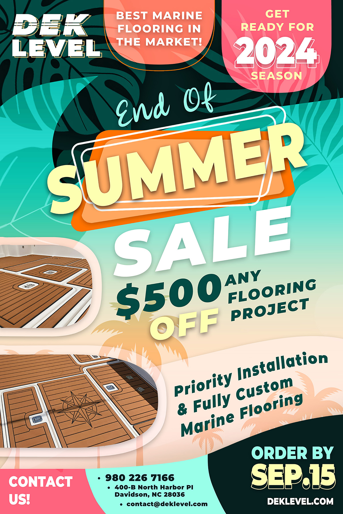
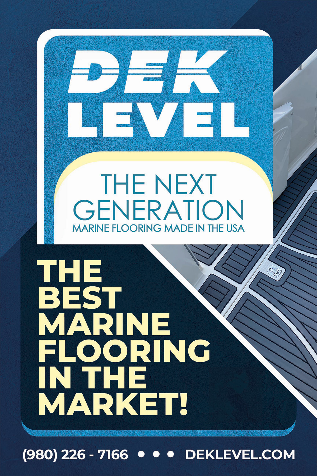
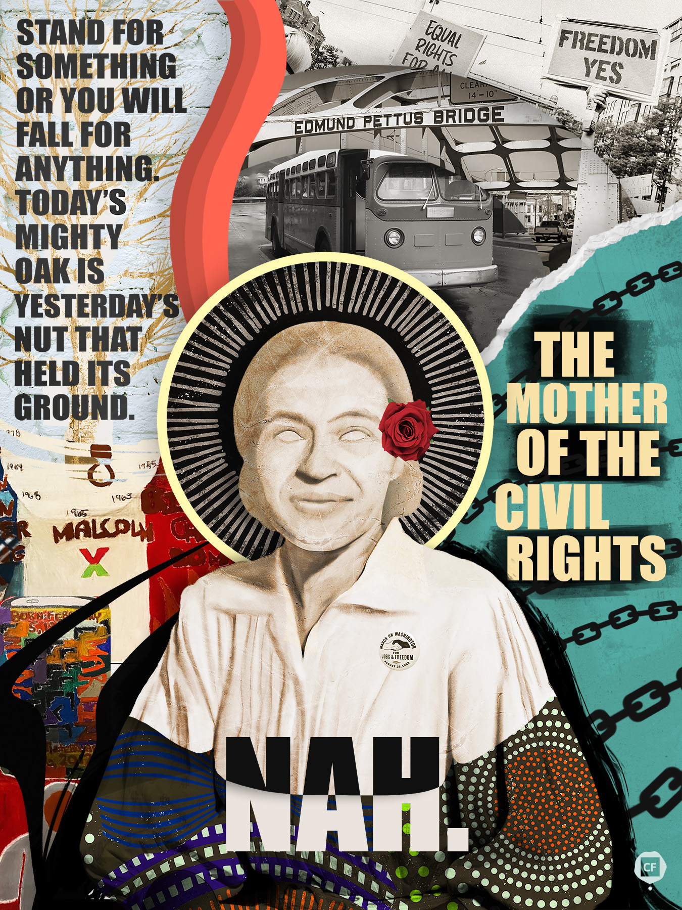
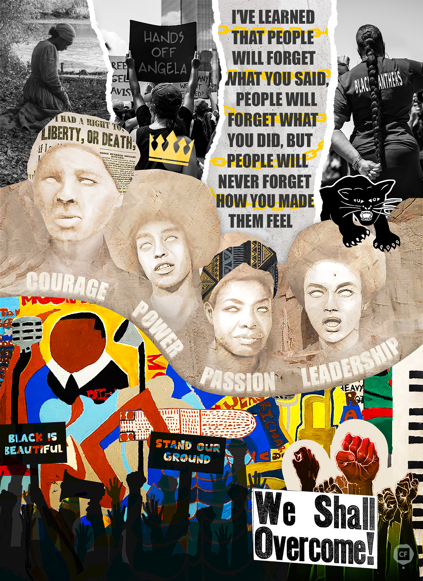
A collection of posters that I’ve designed for marketing projects and commissions. Blending creativity, clear messaging, and a bit of fun. Each piece reflects my approach to bold and effective design.
BRAND IDENTITY
I’ve designed logos for local events and commissioned projects, ensuring each one effectively represents the brand’s identity and aligns with the project’s goals.
Editorial Design
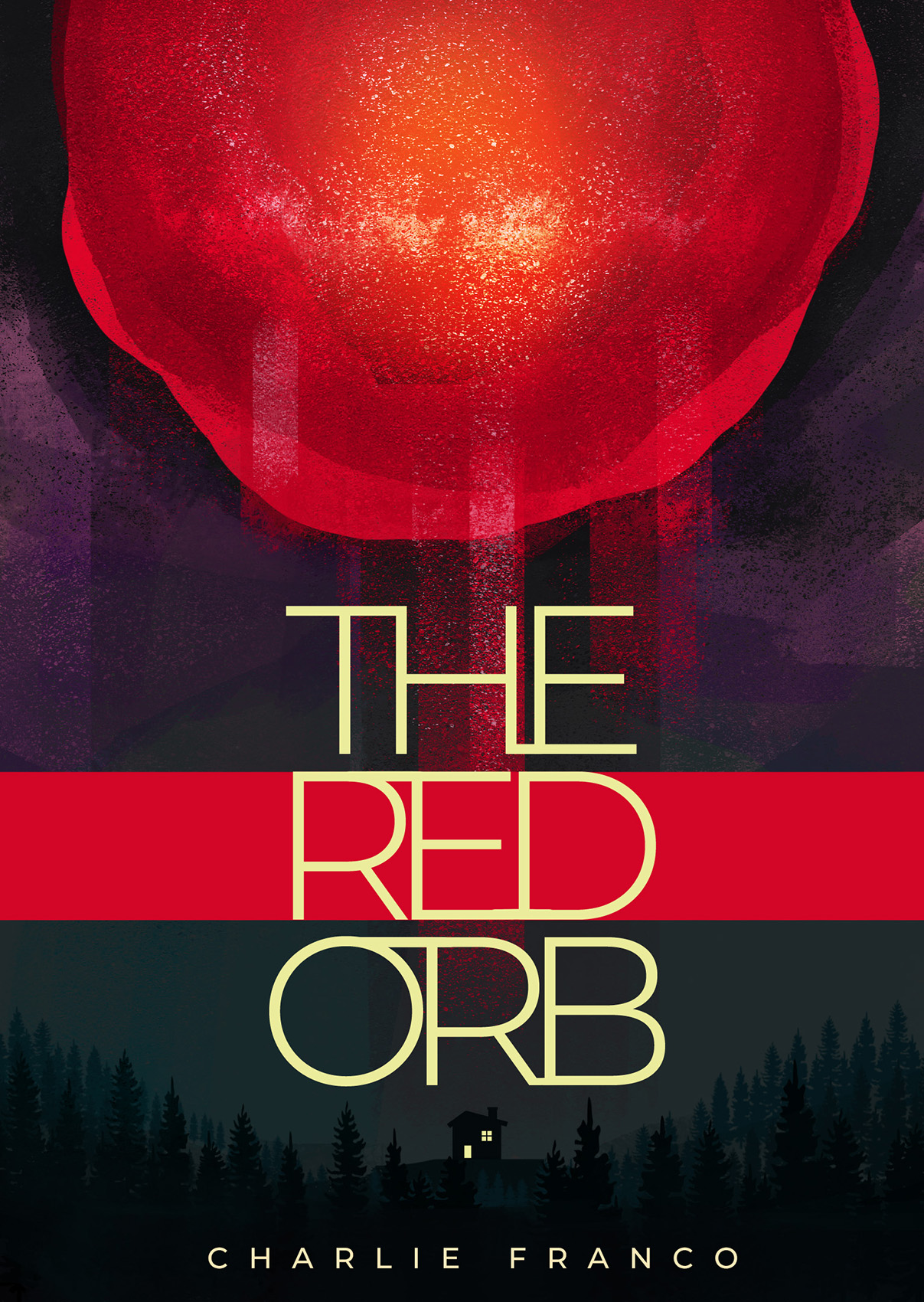
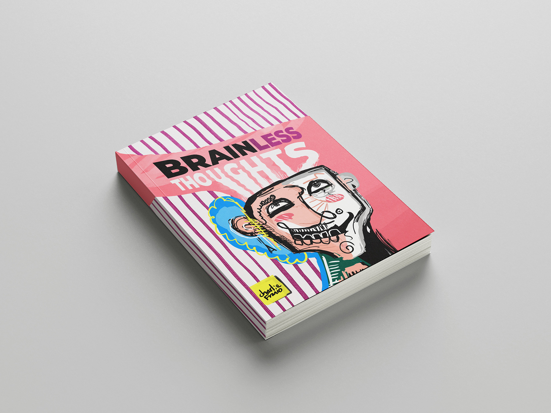
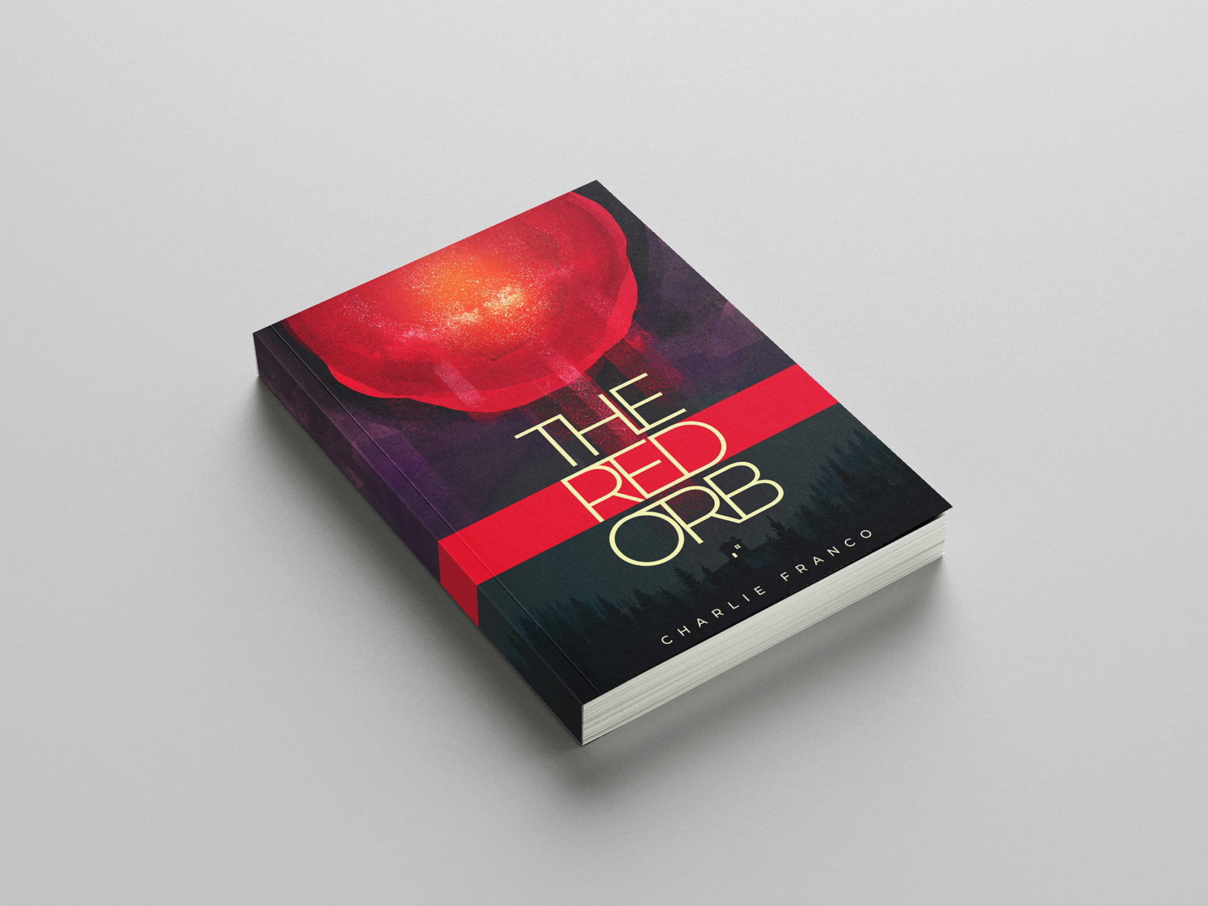
These are a collection of individual book covers created as personal design exercises. Each cover is based on a random concepts, allowing me to explore different genres, visual styles, and storytelling techniques while pushing my creative boundaries.
Web Design
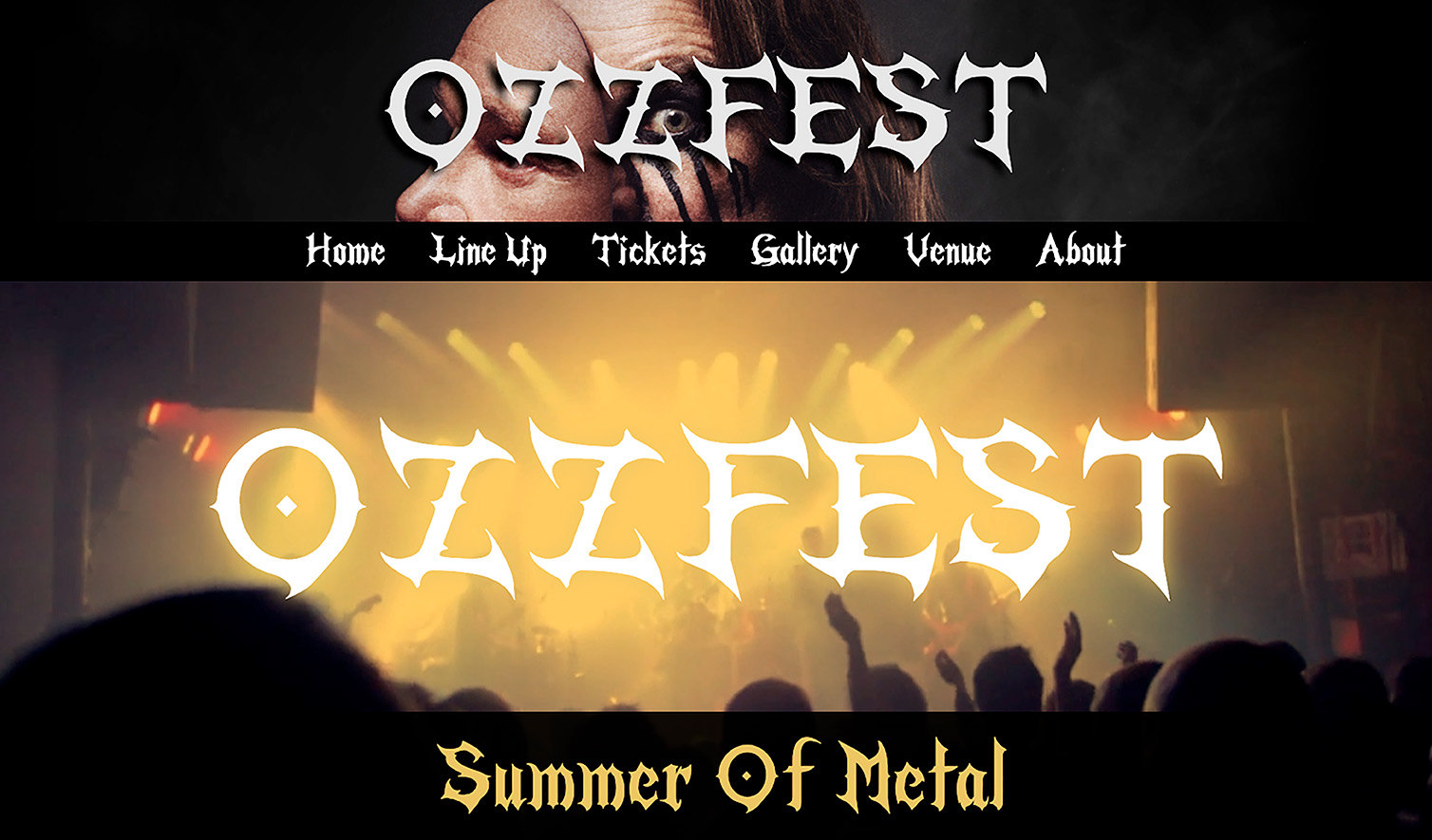
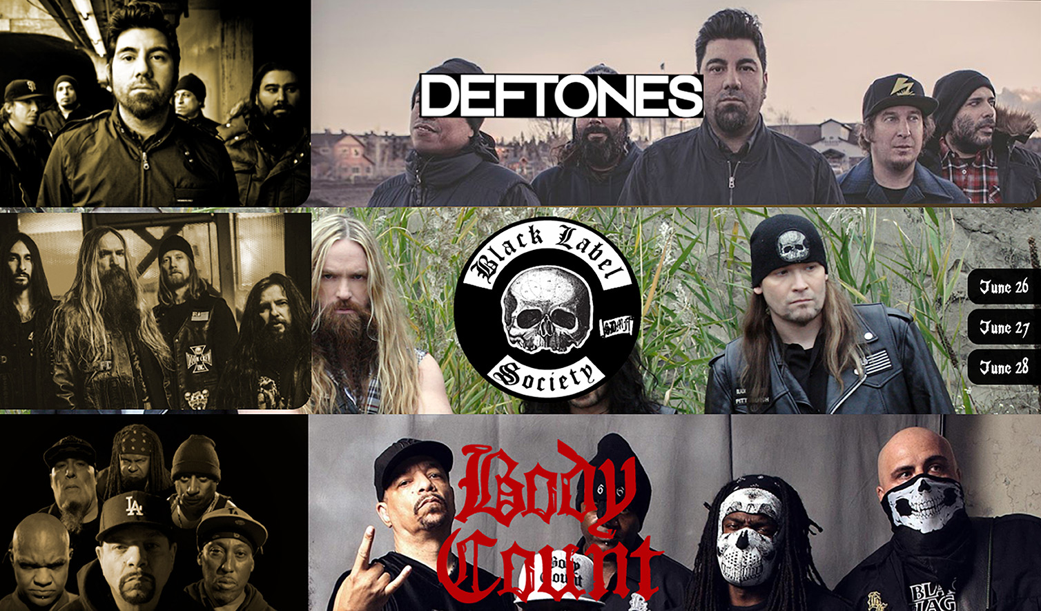
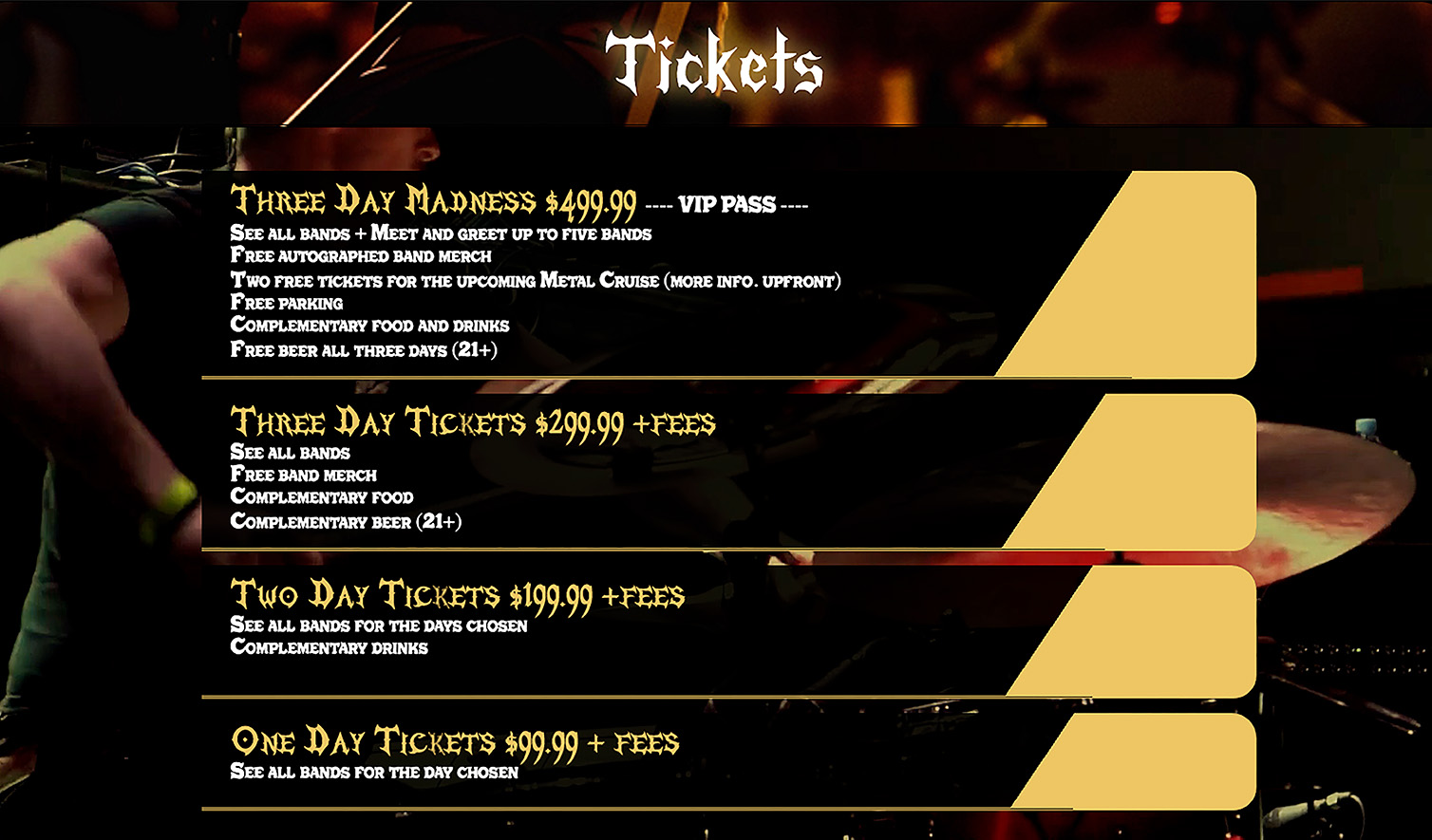
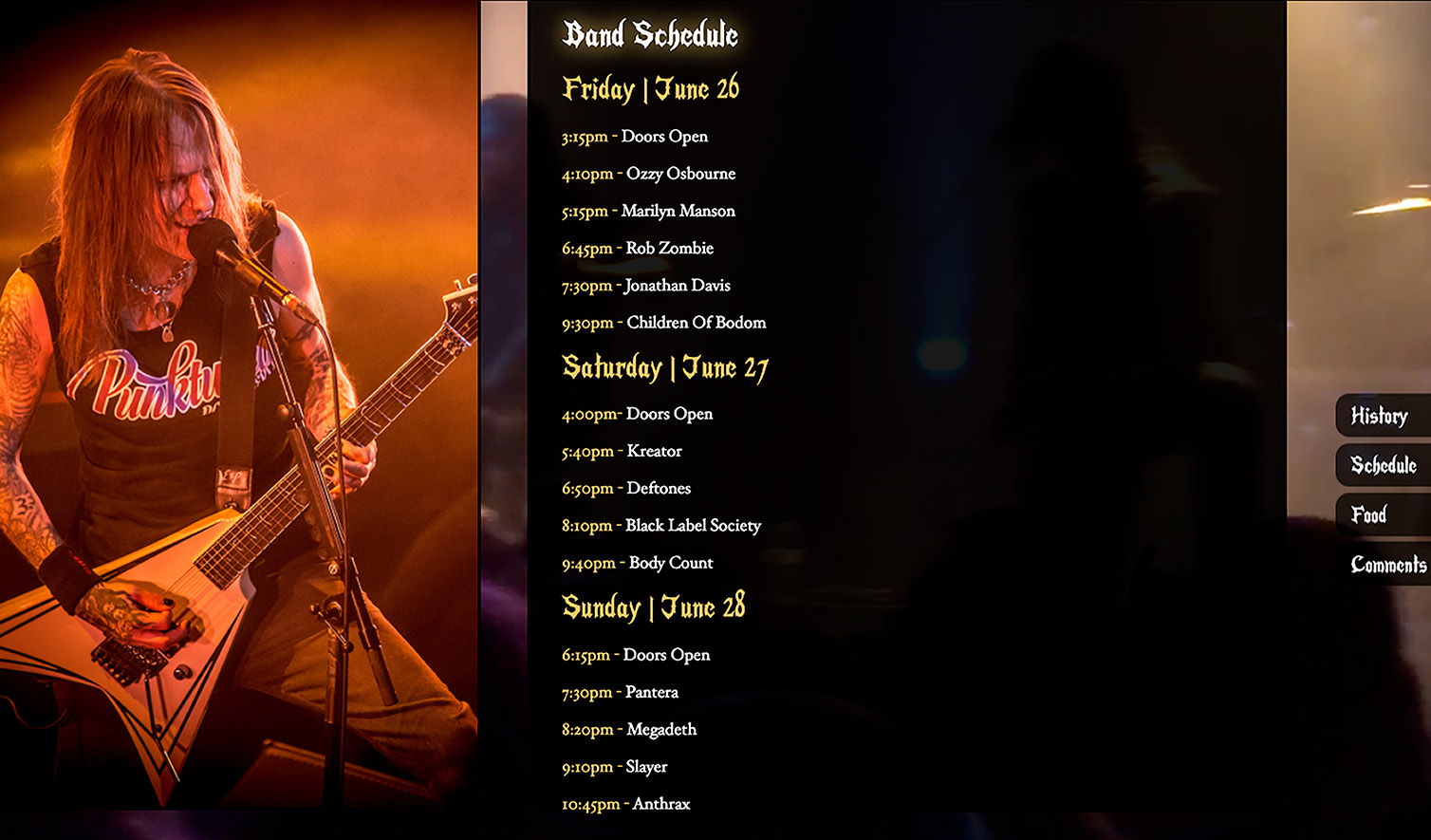
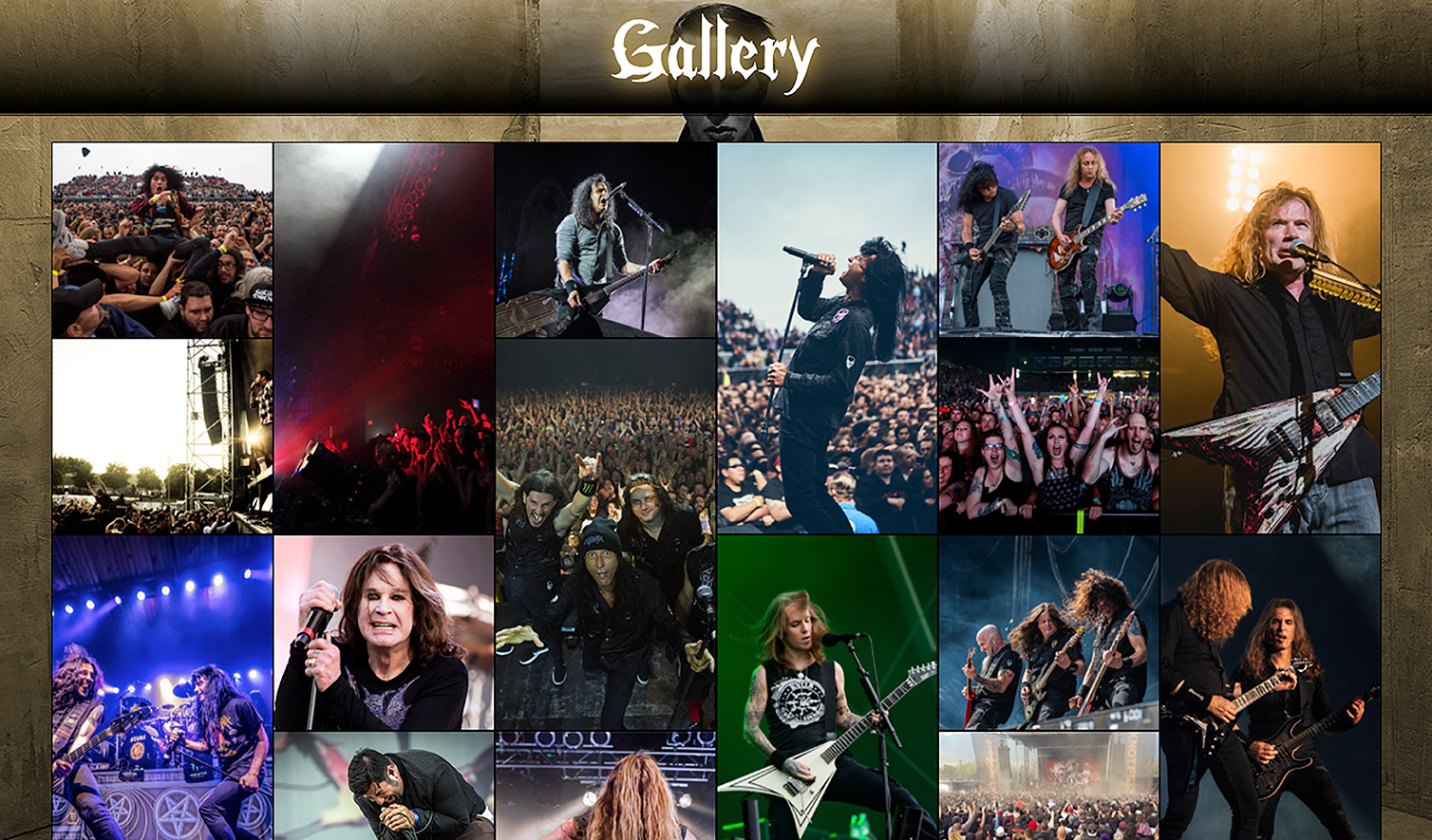
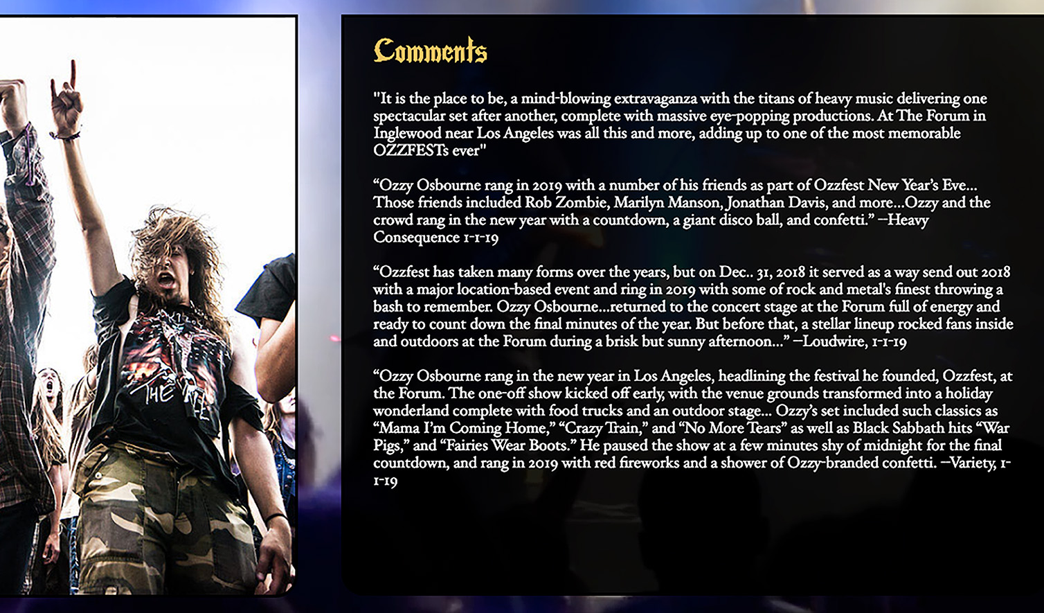
I designed and developed a website inspired by Ozzy Osbourne’s iconic Ozzfest music festival. This personal project allowed me to explore bold, dynamic layouts and dark, edgy aesthetics while honing my skills in user experience and responsive design.